Ever since I have come back to London I always wanted to do a blog post and data viz on something meaning full related to Europe (though the UK is no longer related to the EU). So in this post, I am doing a project on energy usage in different European countries.
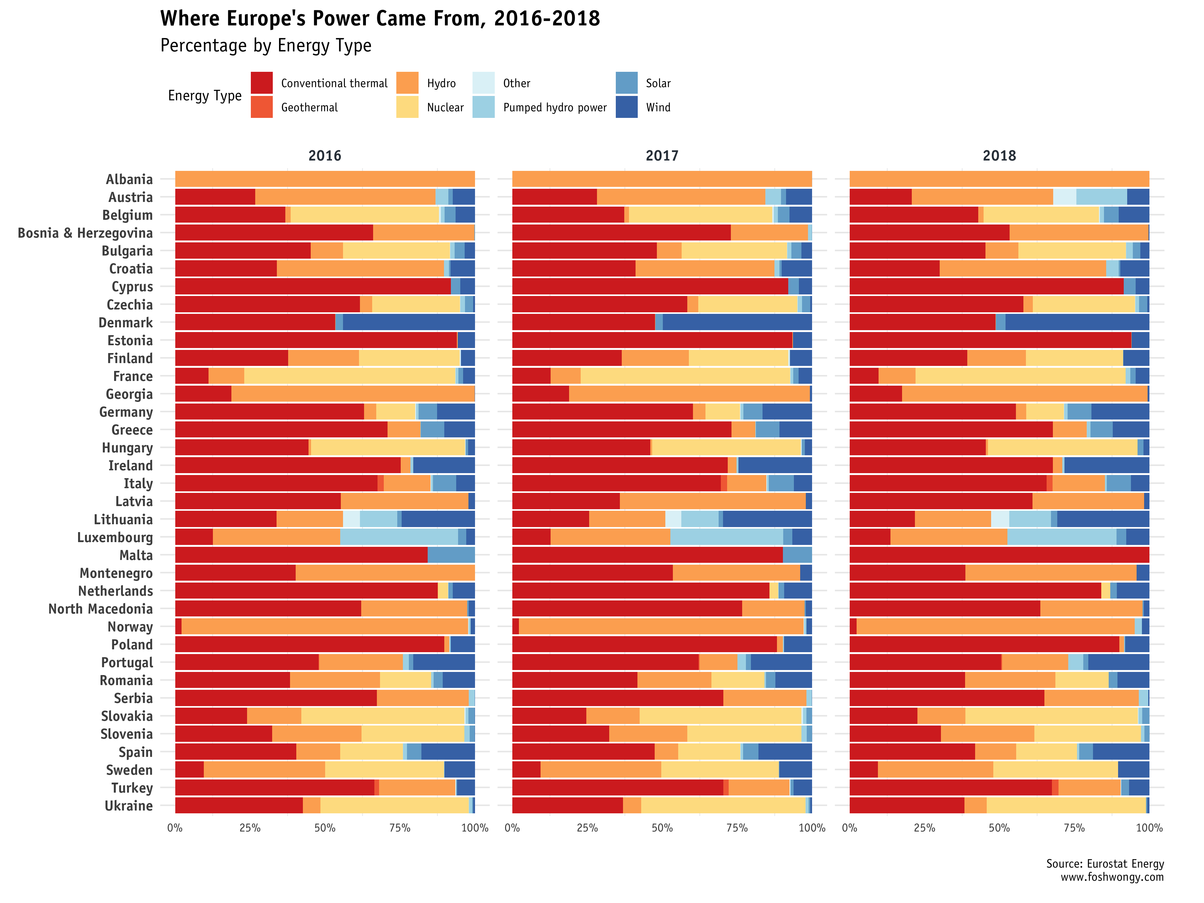
Firstly, we can have a board sense of the energy production distribution of various energy from 2016 to 2018. While most of the countries do not have much different in the energy production allocation, countries like Austria tend to use less Hydro energy
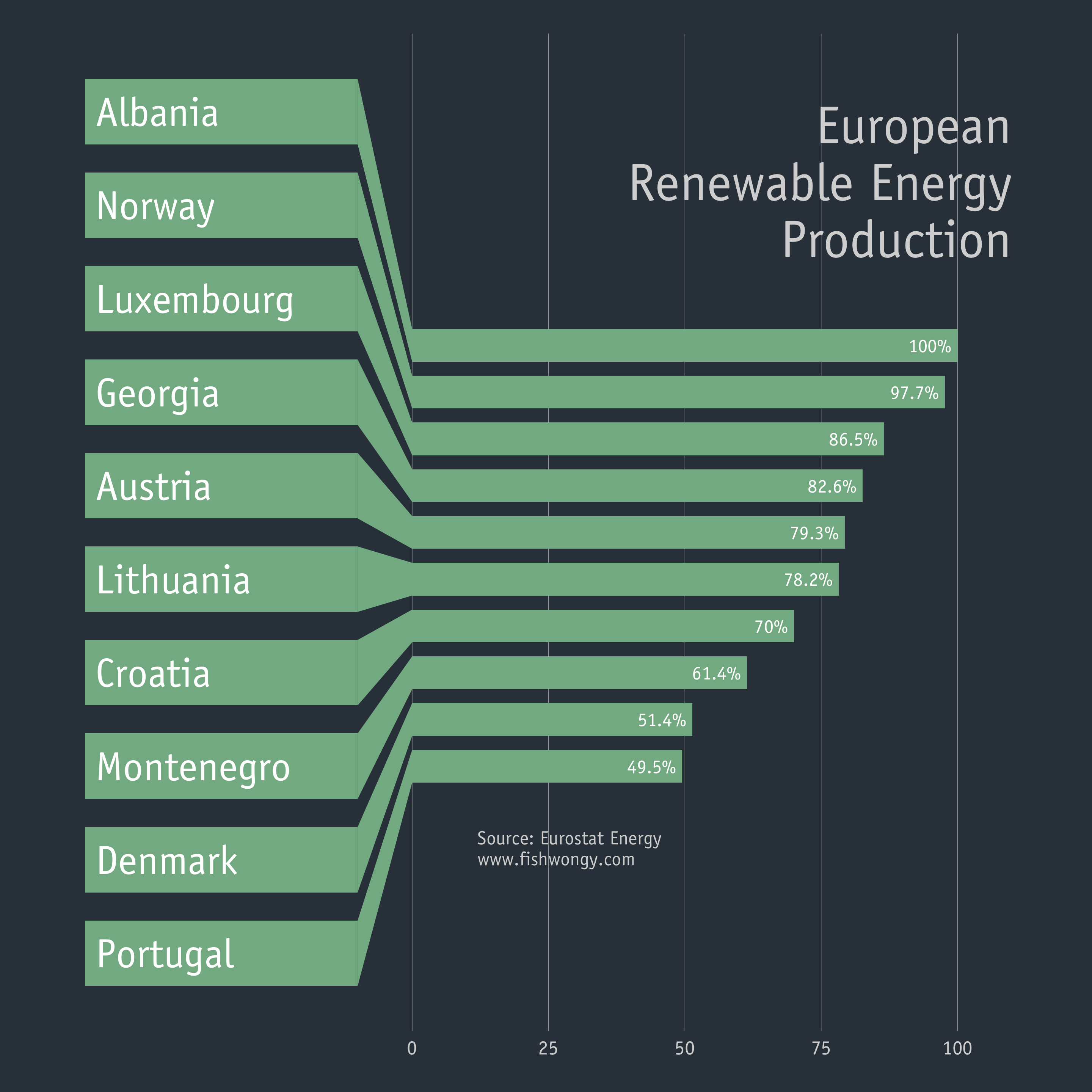
Then we can have a look at the top 10 European countries that produce the most renewable energy. Unsurprisingly Albania and Norway are the top countries in terms of clean energy production.
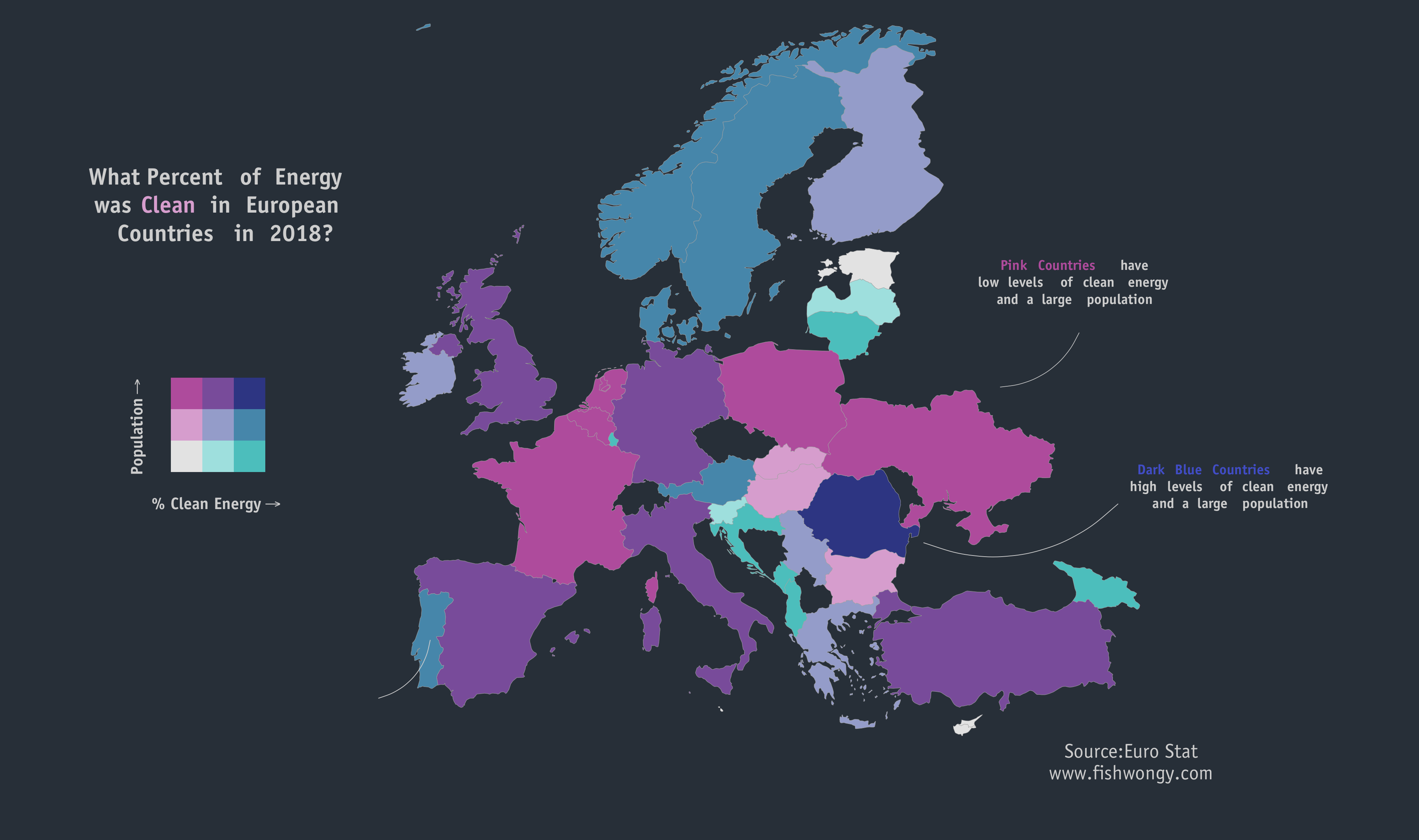
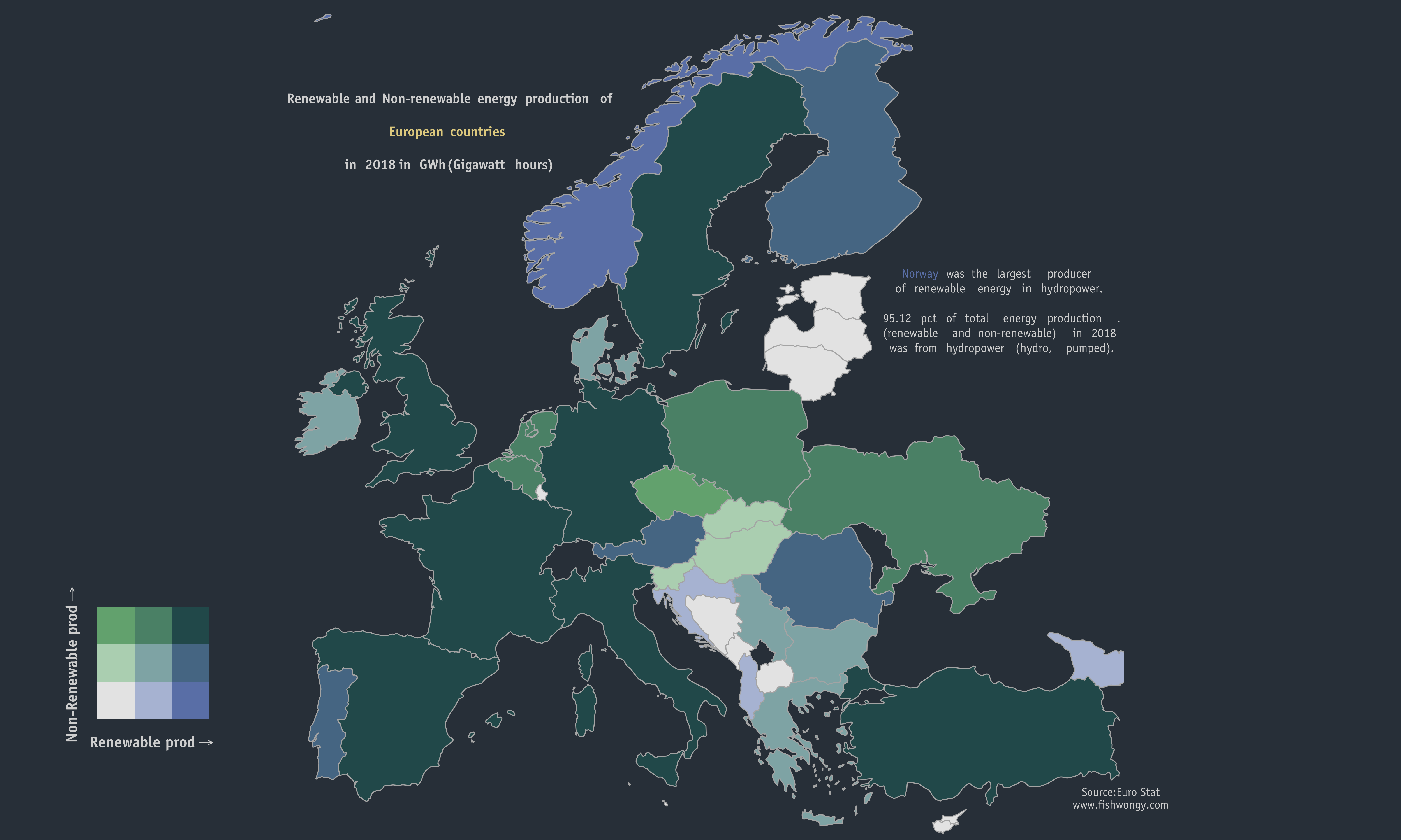
Below are 2 bi-scale different maps showing different information.
Here is a map showing the relation of population and the percentage of clean energy produced by each country in 2018. Surprisingly, Romania is in coloured in dark blue.
Then we can take a closer look at the proportion of renewable and non-renewable energy production in different countries. Southern Europe countries like Italy, Spain and France tend to have a larger proportion of renewable energy production in relation to non-renewable energy. And the same applies to Norway, Albania and UK and Northern Ireland.
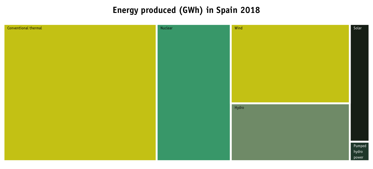
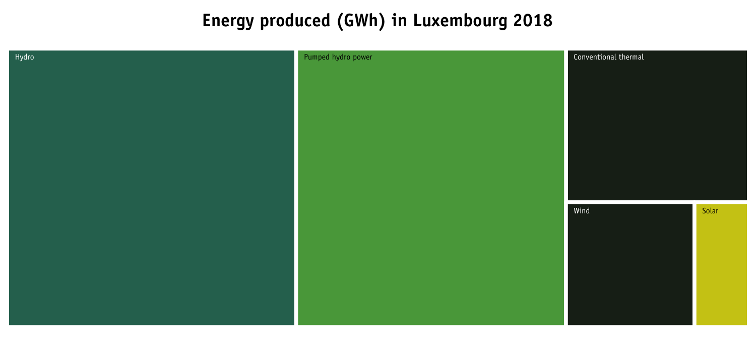
Lastly, here are 2 treemaps that I’m trying out to produce with Spain and Luxembourg, with the size of the rectangle is in the proportion of the amount of that type of energy is produced.