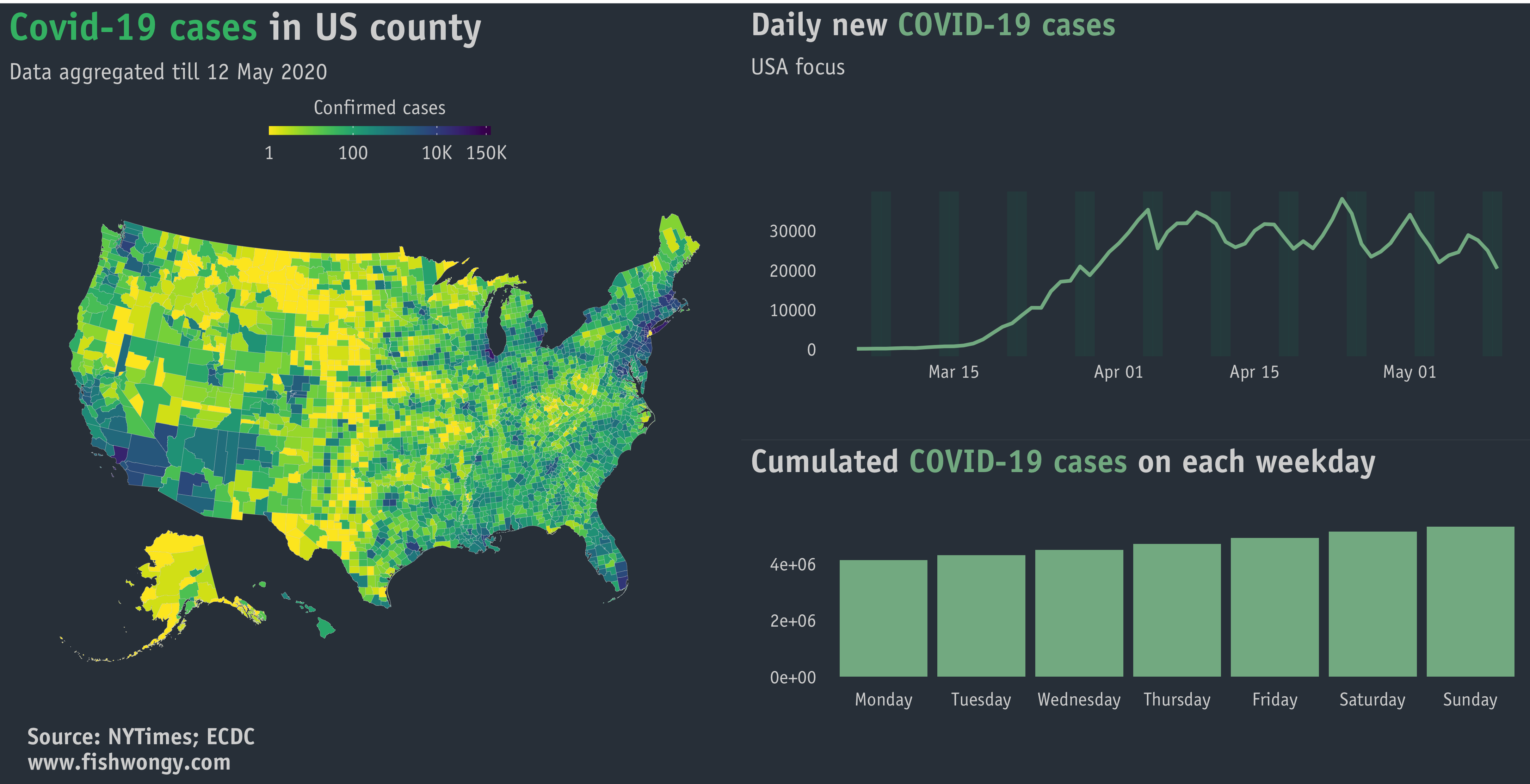
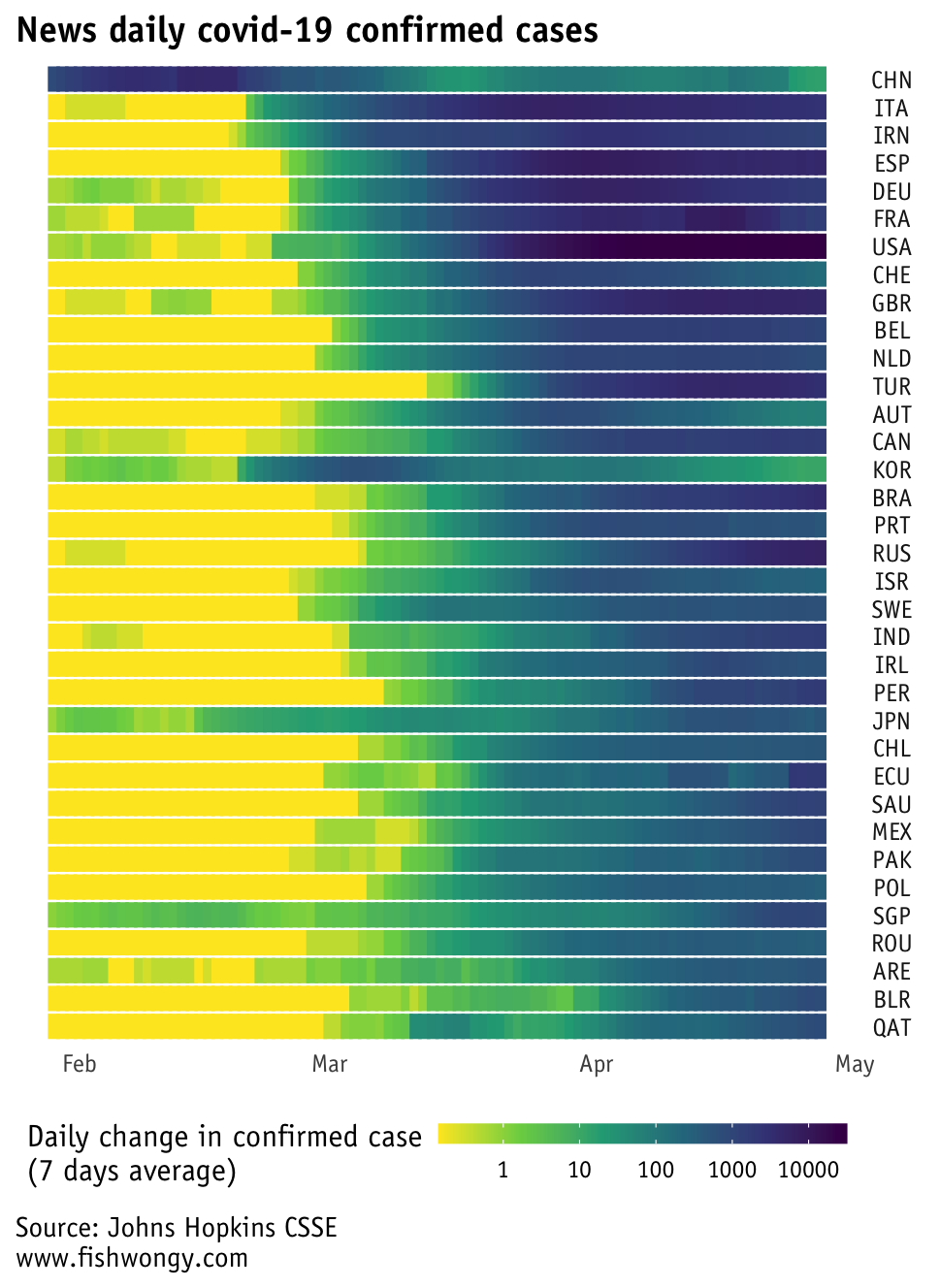
Excess deaths seem to be a popular benchmark to check out these days regarding covid-19.
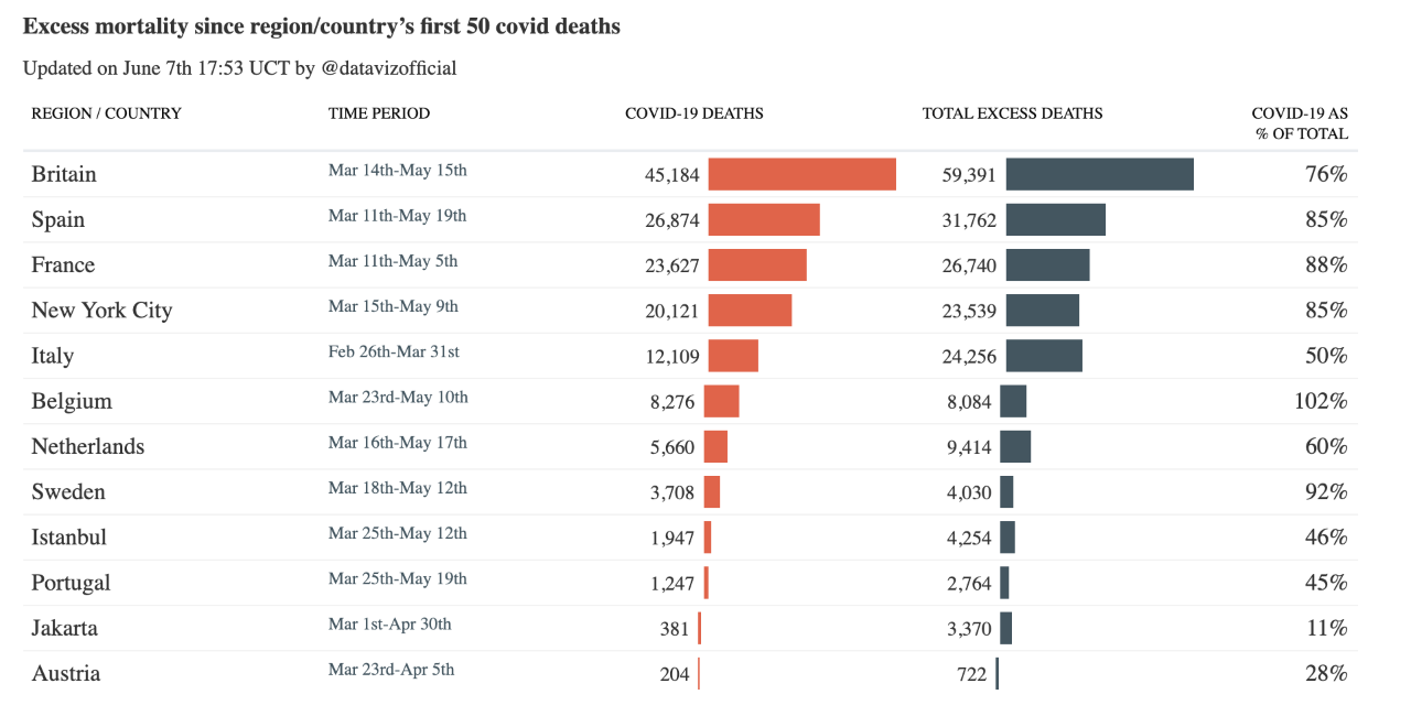
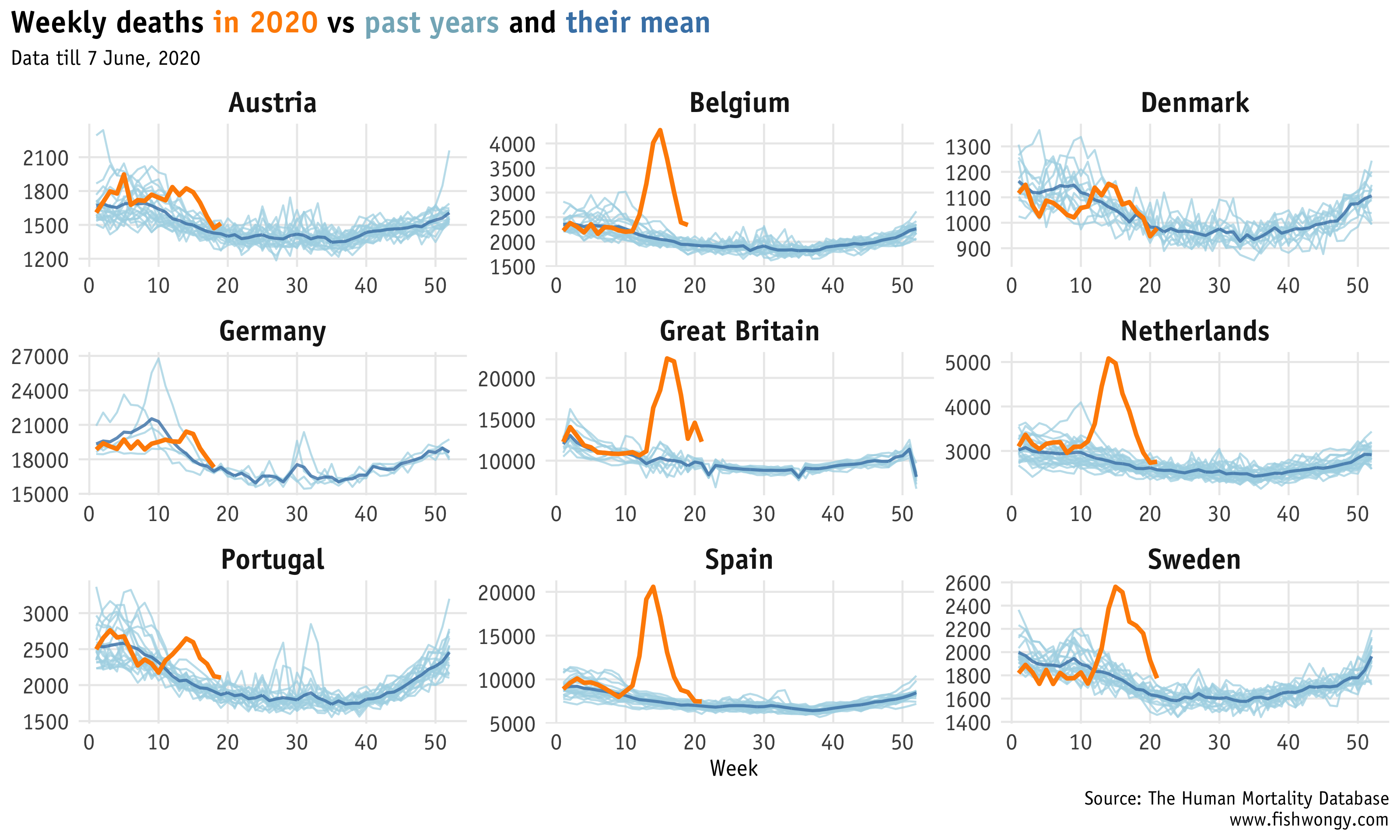
From the graph below, we can see that seems like some countries are having trouble with reporting deaths?
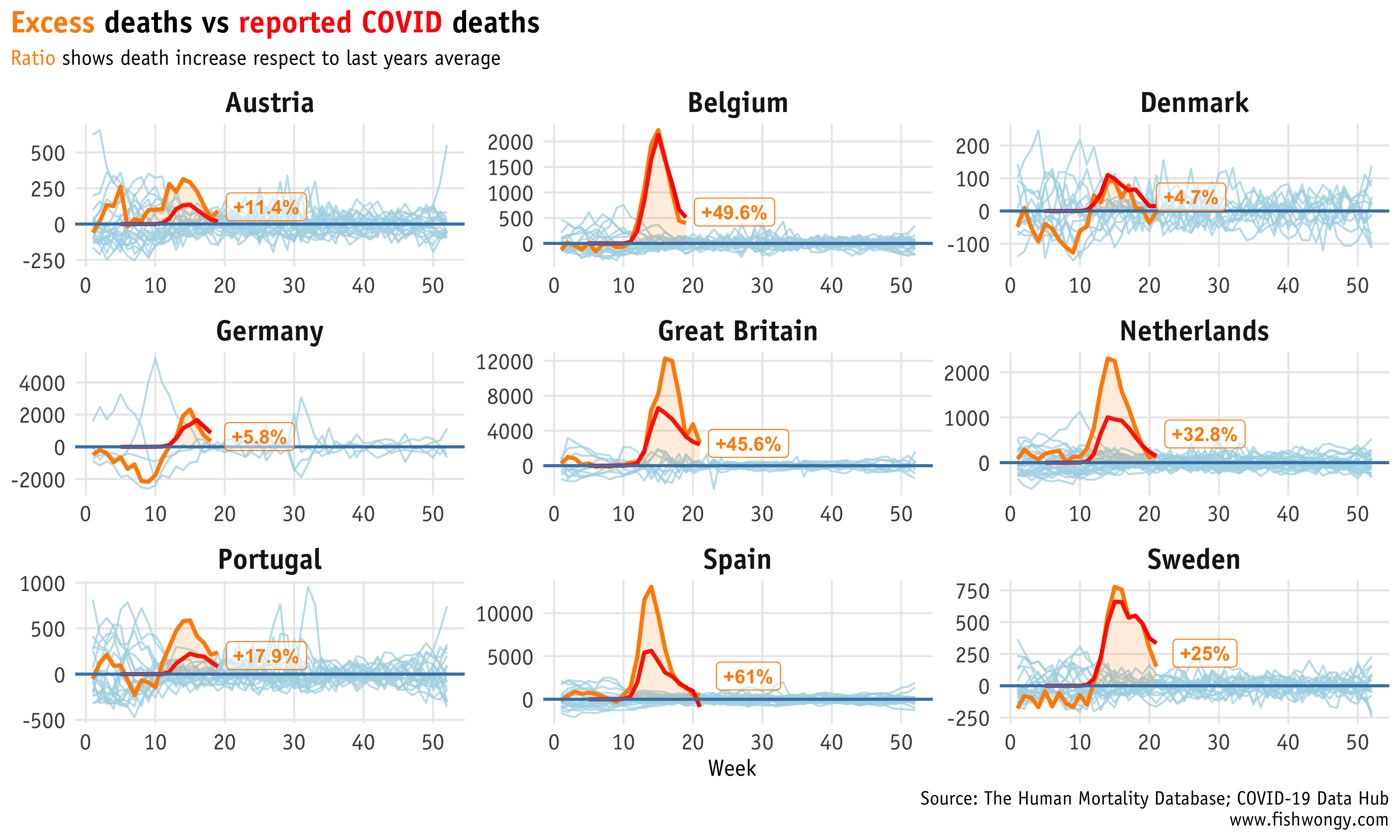
And here is the comparison of deaths count in selected countries.
I saw some people might use this as an indicator for lock-down effectiveness and social measures effectiveness, though, I am not so sure is this the best indicator to use. Nevertheless, I find this graph interesting to explore.
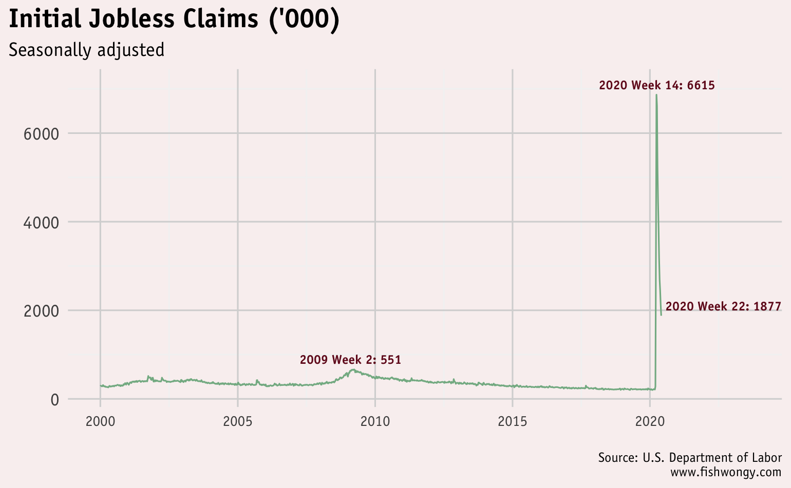
Then I want to explore the unemployment rate from the US. CNBC recently posted a graph that attracts a tremendous amount of criticism.
Hopefully, my graph will provide another side of the story.
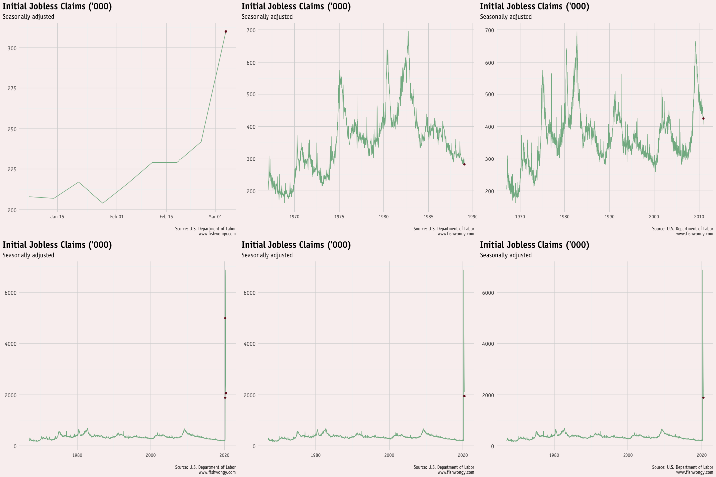
And here is an animated version of the graph
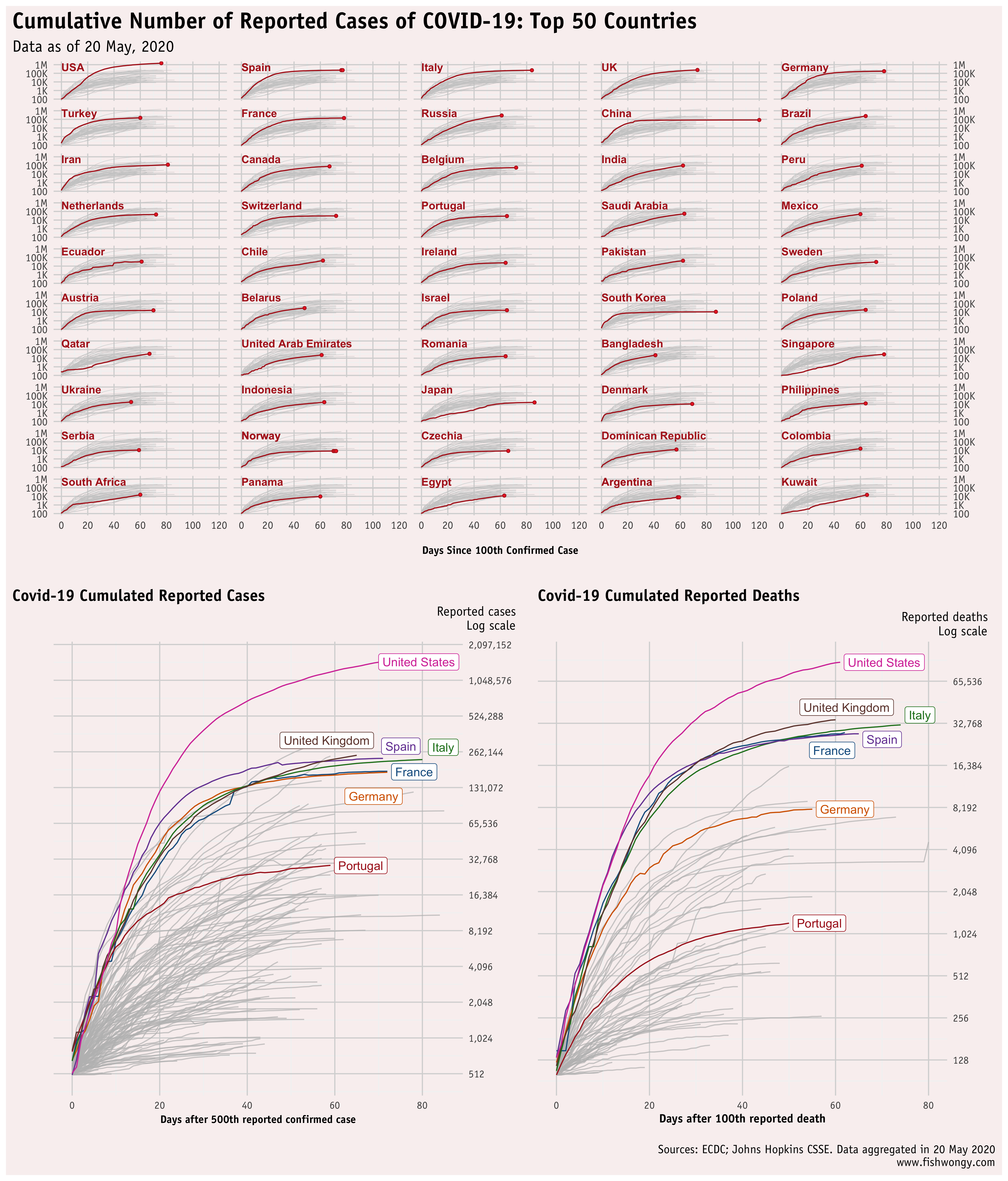
Lastly, I go back to visualised the initially most famous graphs from the FT with selected countries.
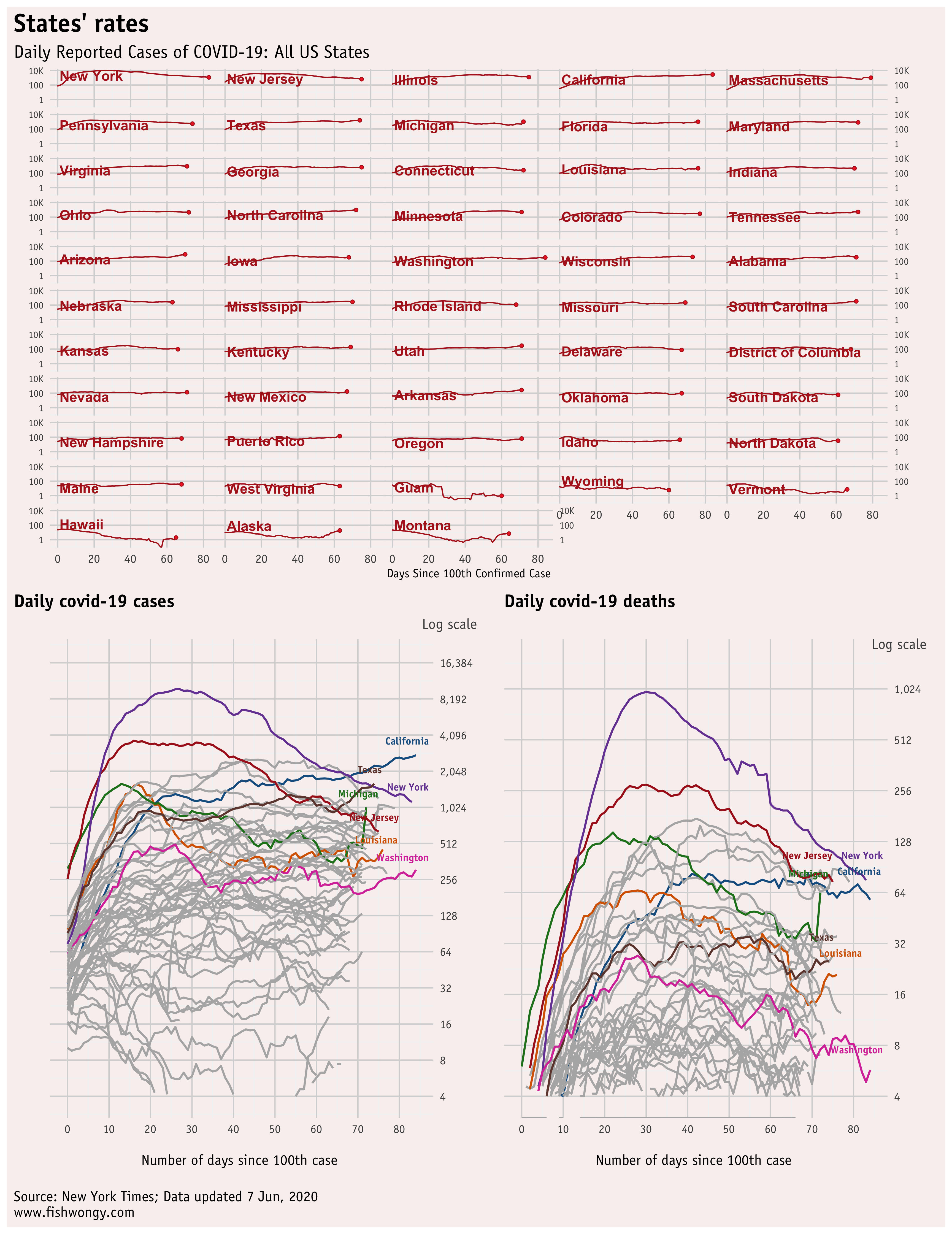
Here are the daily graphs. Brazil’s lines still look worrisome, aren’t they?
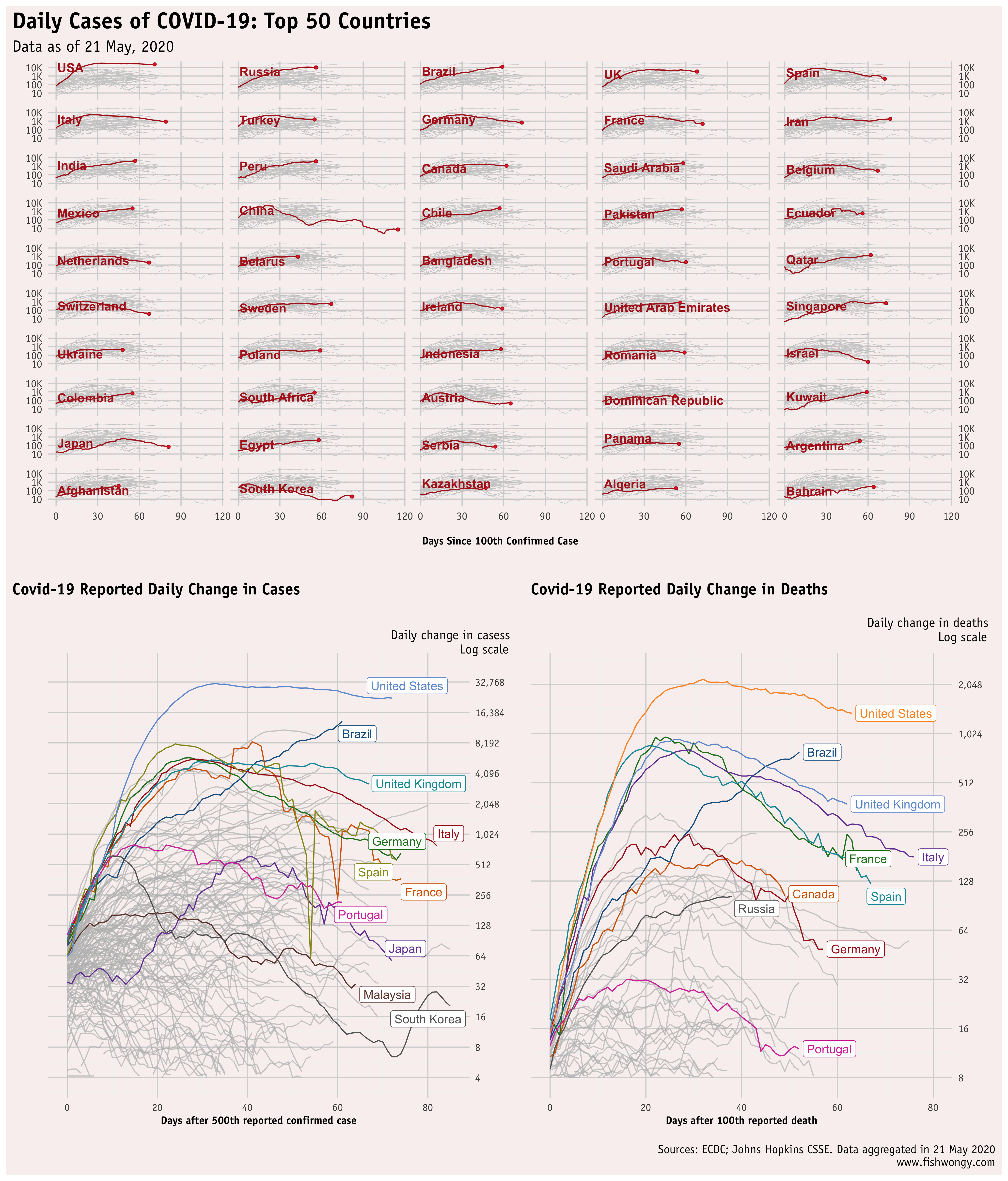
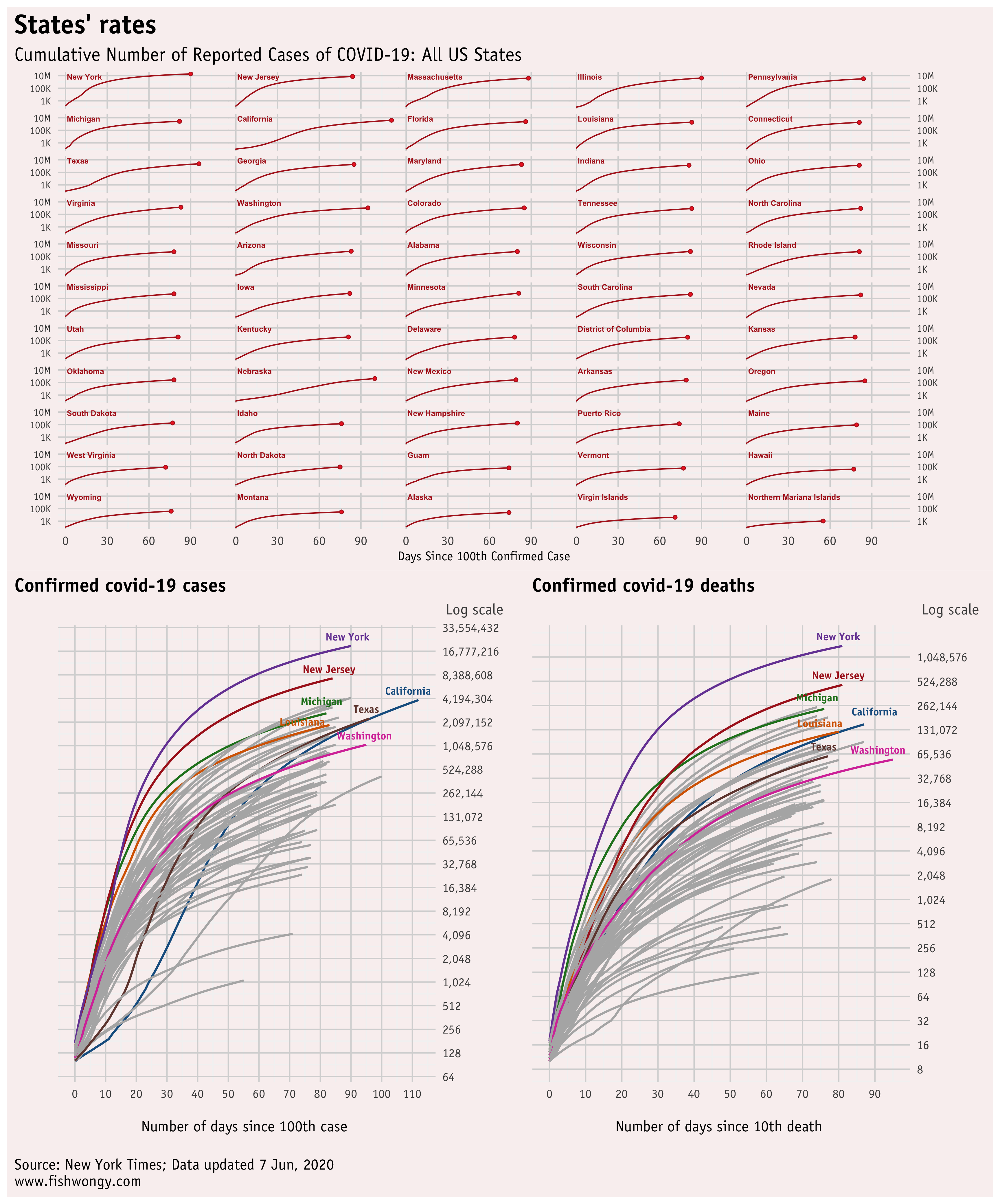
And here are the accumulated graphs
Lastly, here is the US version of the graphs above.
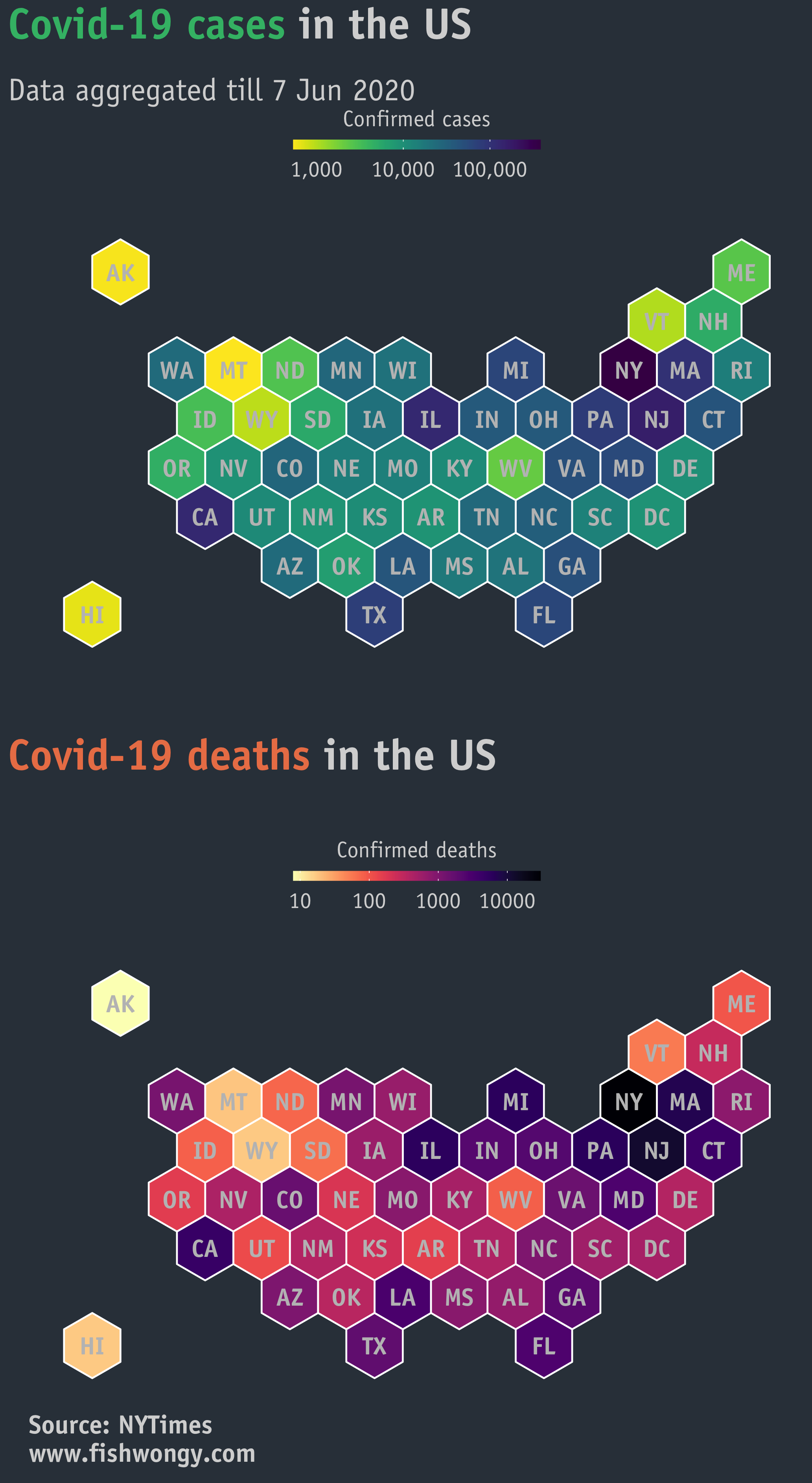
For fun, I produced a hexagon map regarding the number of covid-19 cases and deaths
Thanks for reading. Stay safe!

