Since early May, many countries around the world have loosened their lockdown restrictions. Is the “peak” already passed?
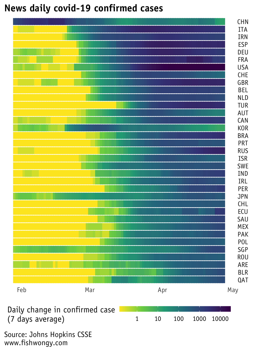
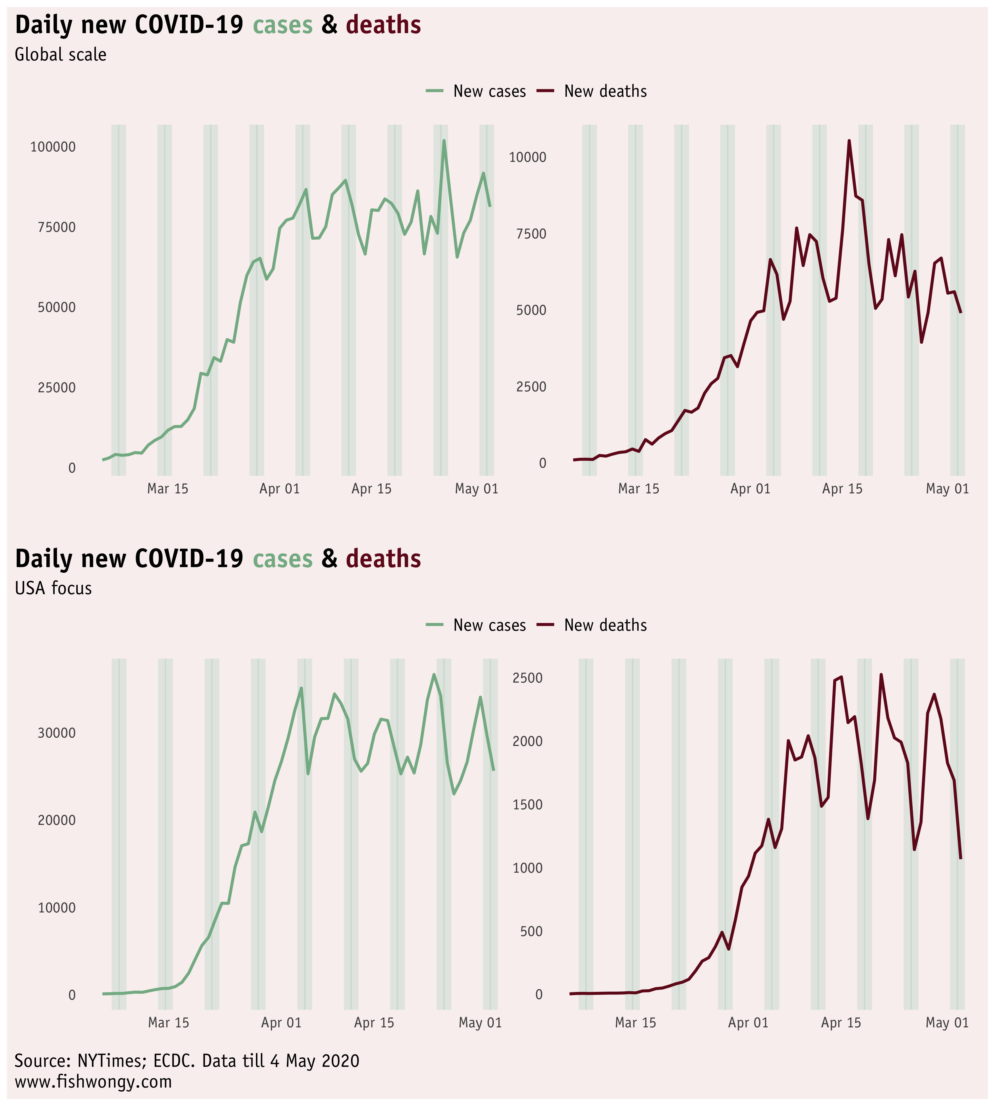
The graph below shows the number of daily covid-19 cases recorded in different countries.
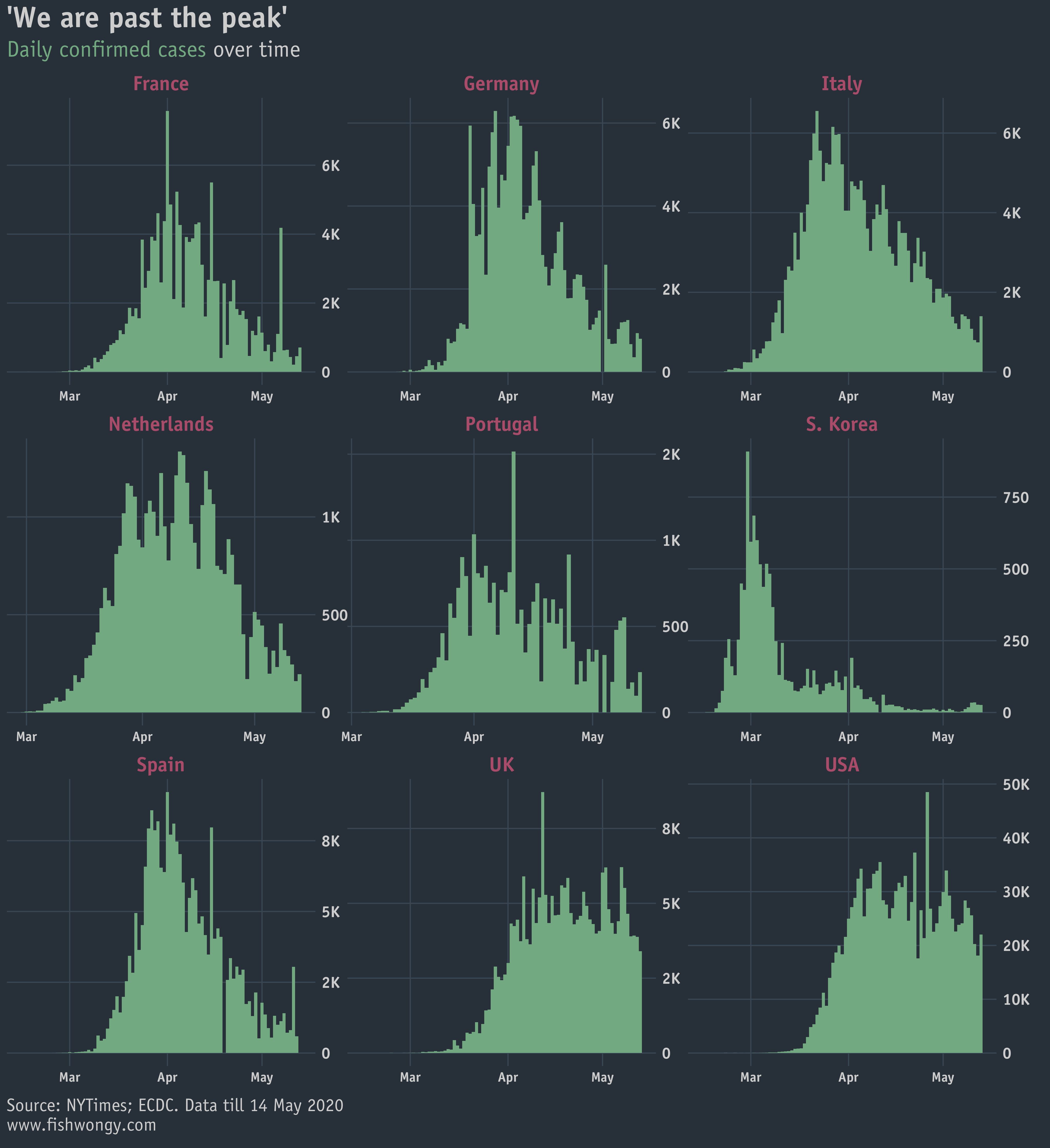
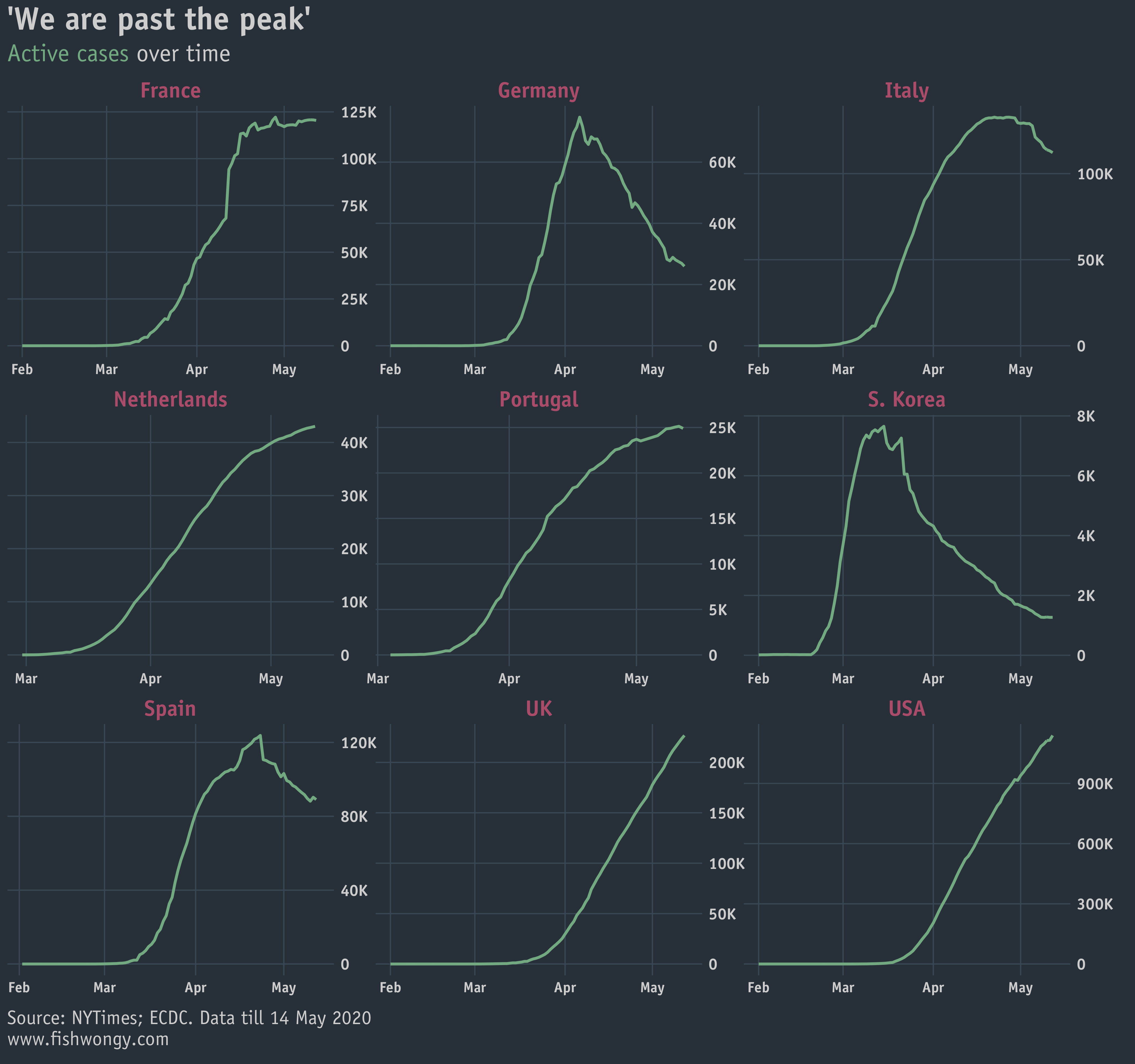
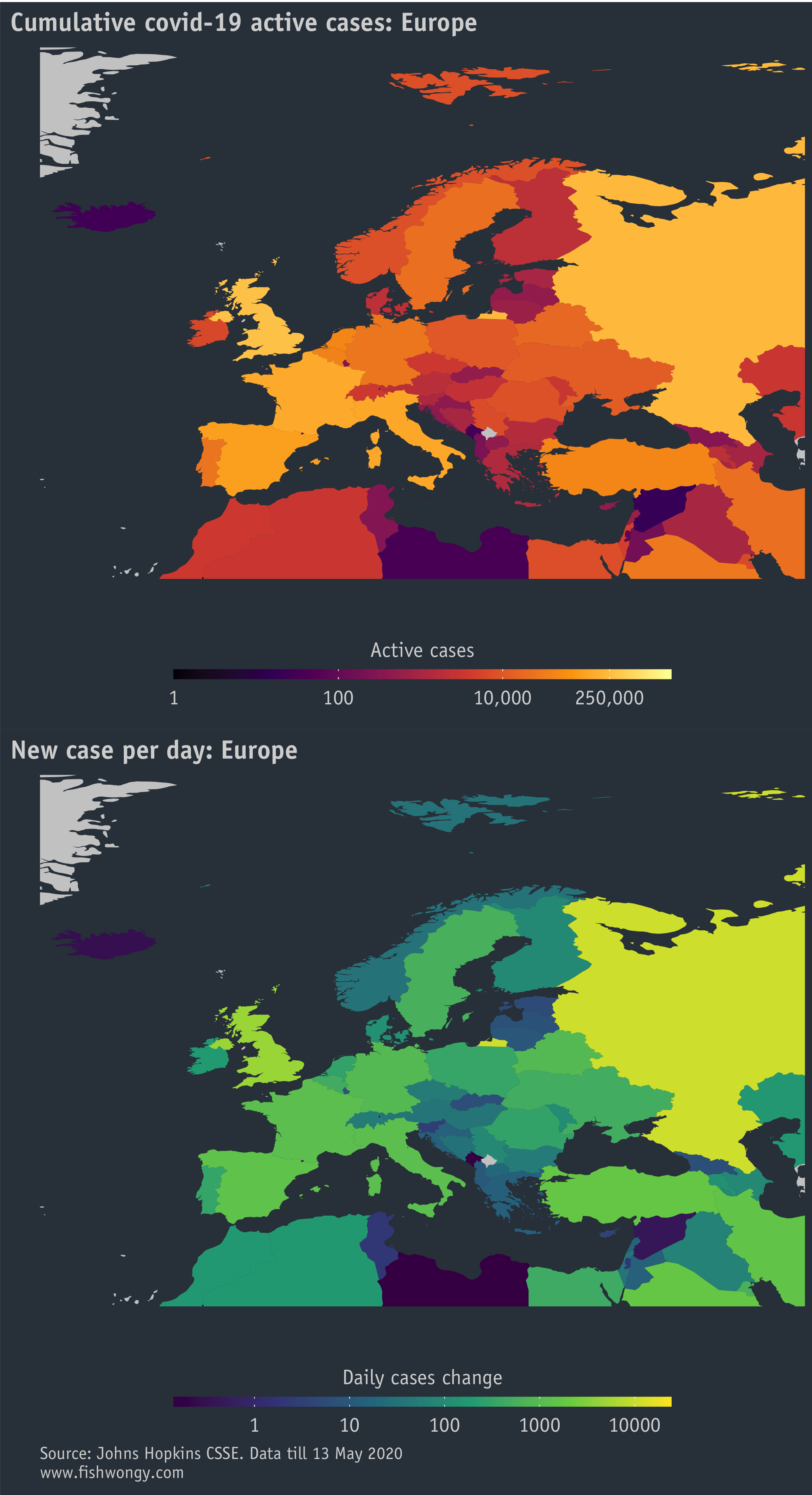
Although it seems most of the chosen countries have passed the highest recorded cases day, looking at the active cases might tell another side of the story.
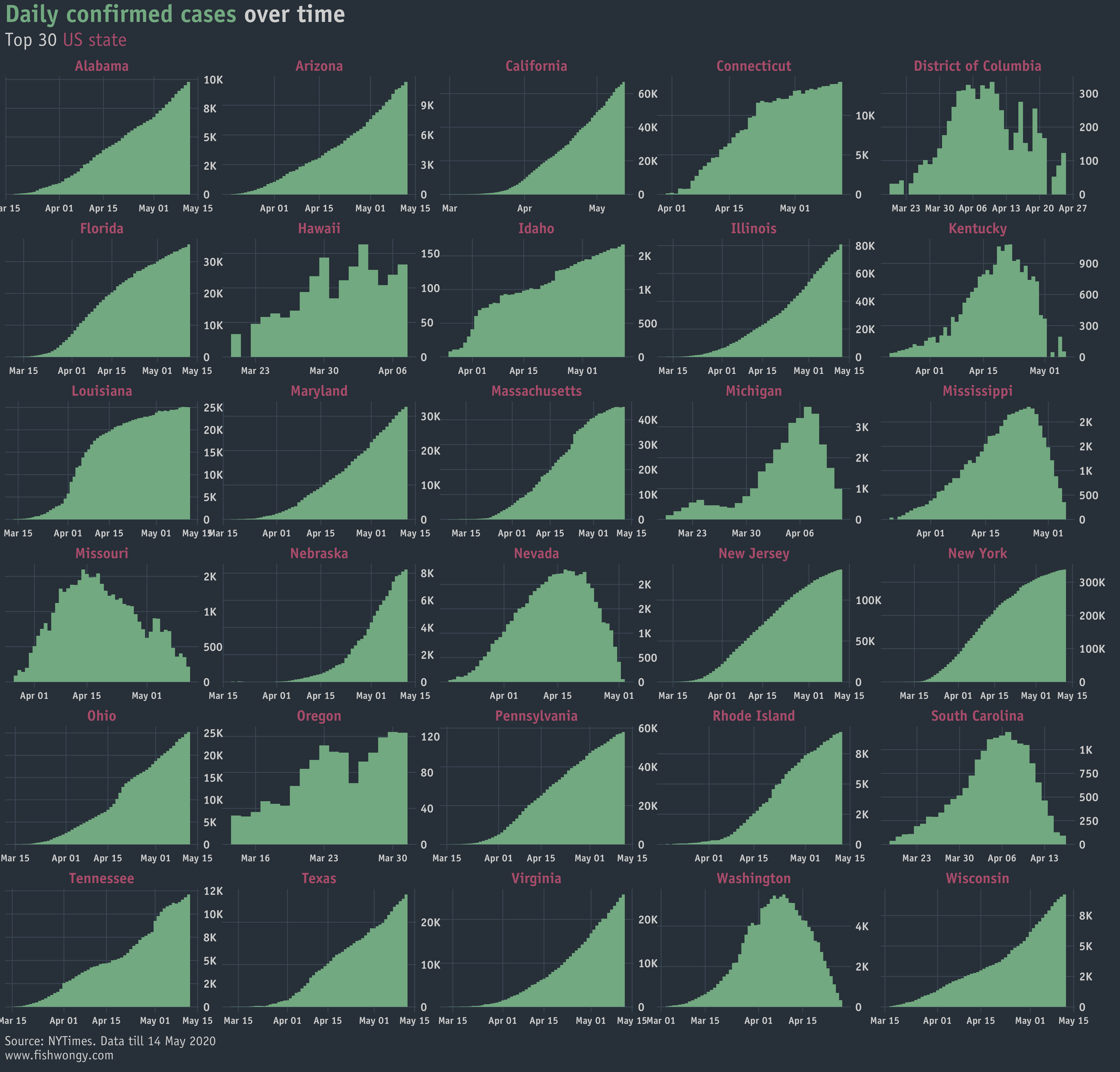
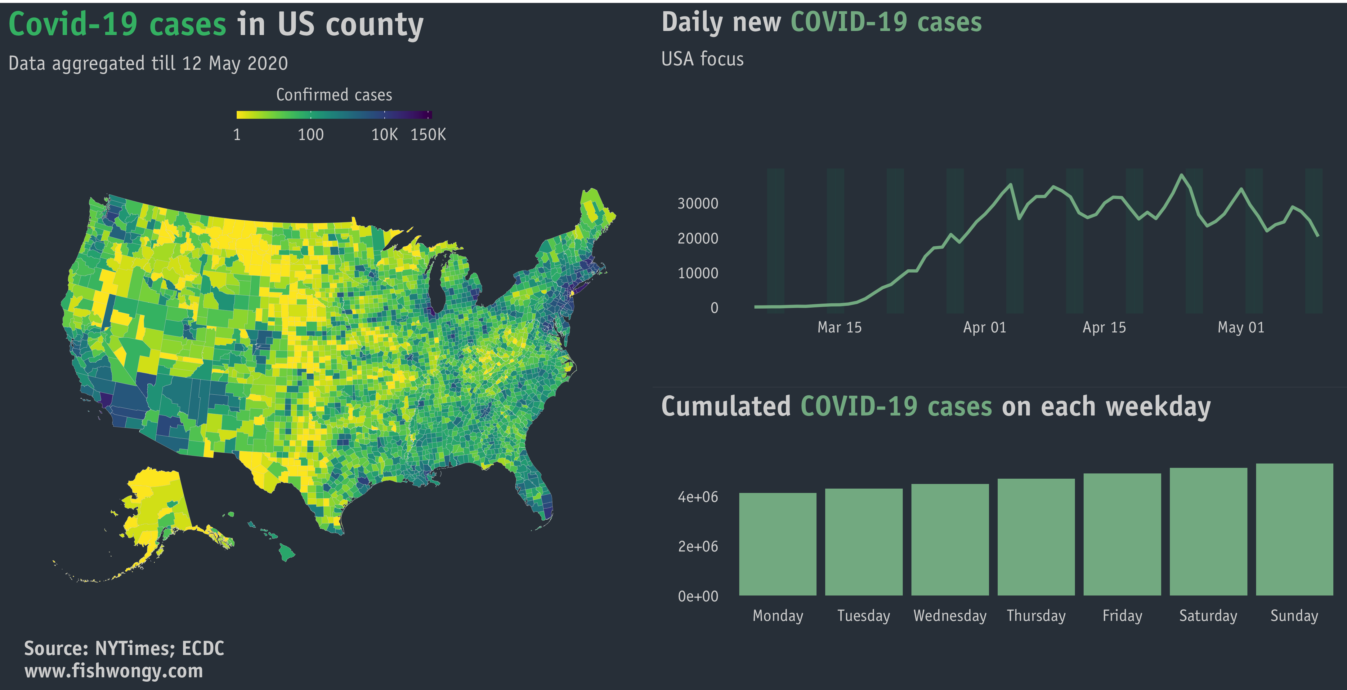
Furthermore, I produced a version that focuses on different states in the US, that might partly show why the USA curve as it is from the graph above.
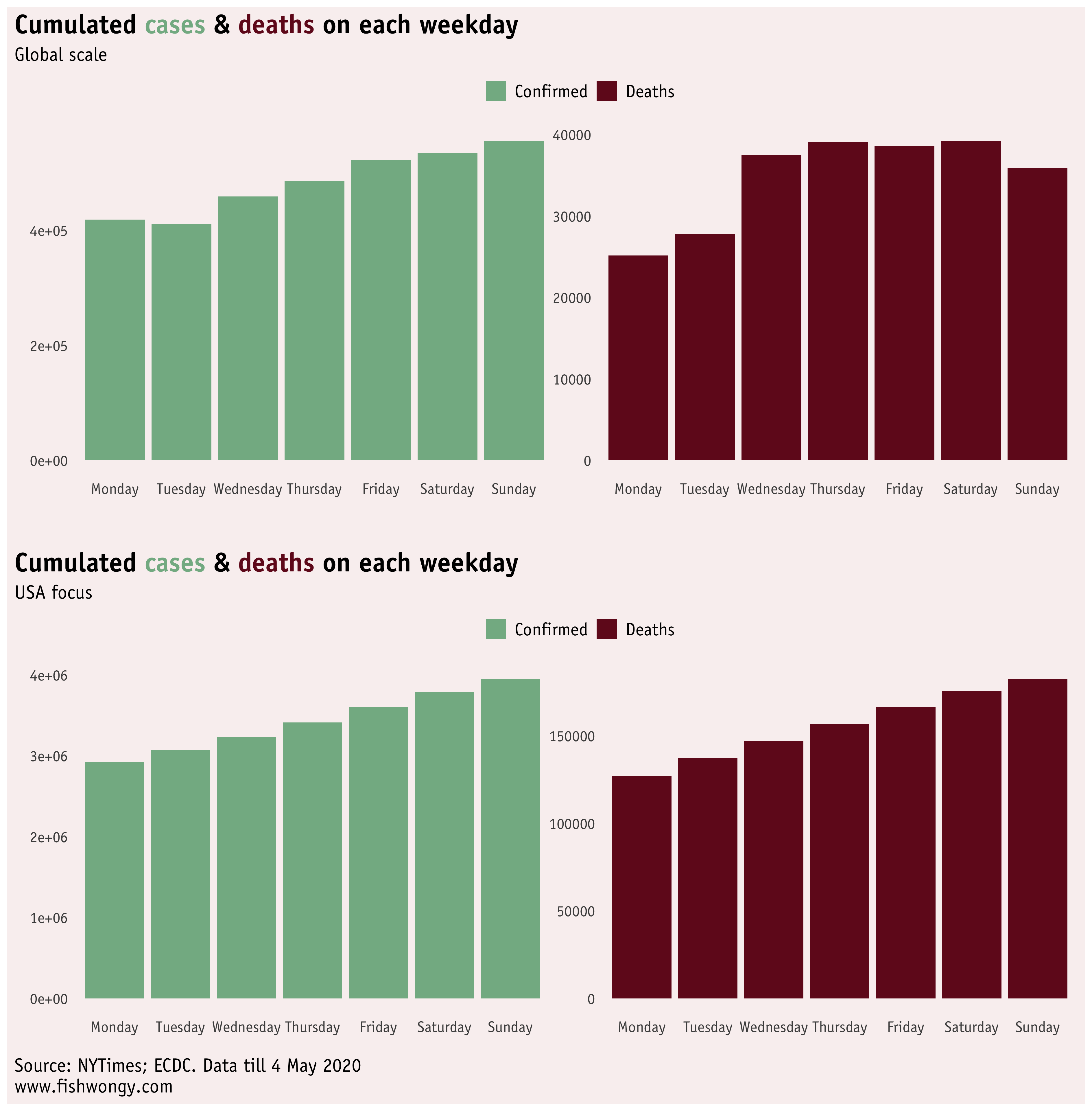
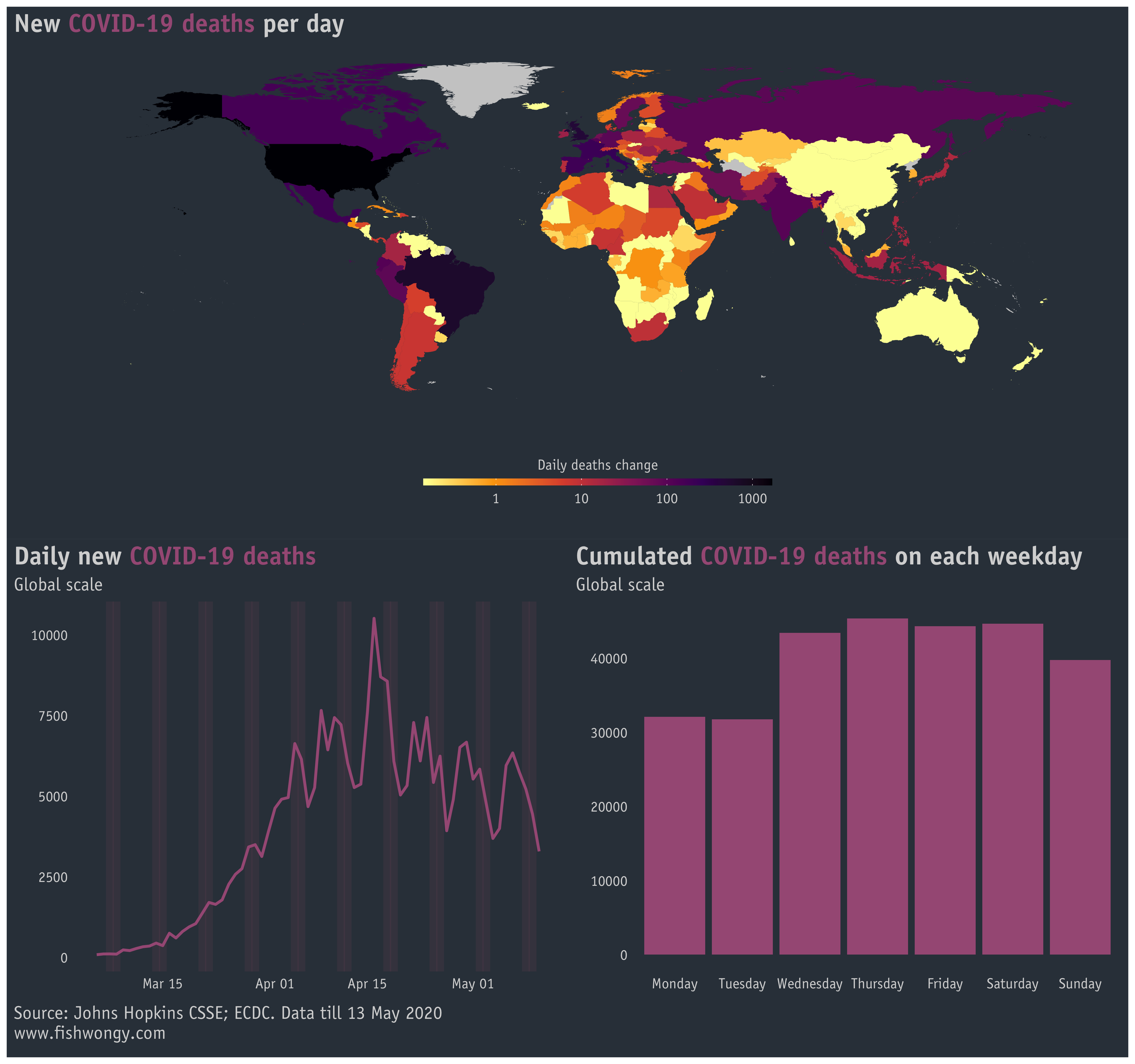
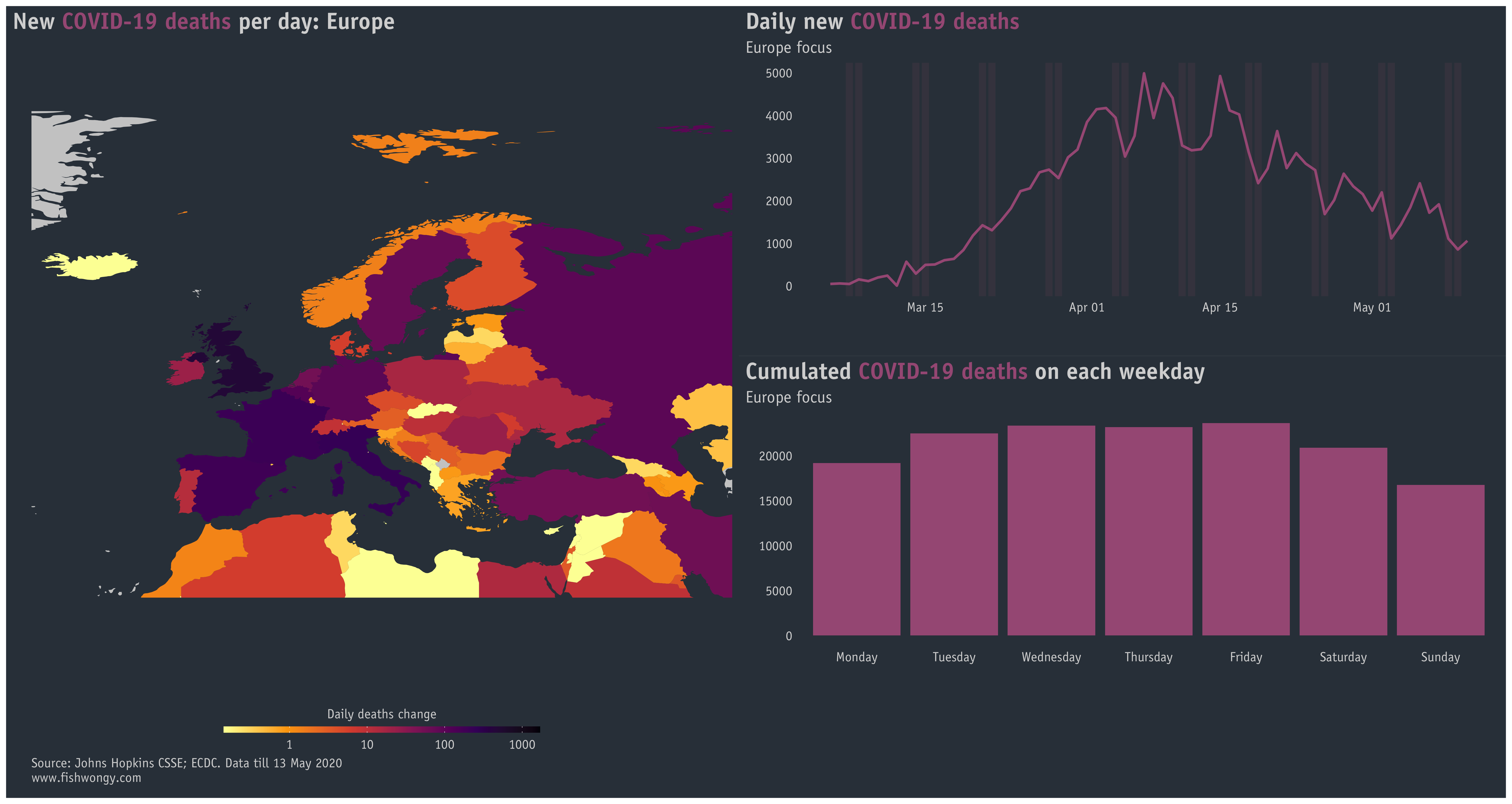
So a while ago, I saw someone said, “people seem to die less during the weekend”. Of course, we know it’s just because people work more on weekdays instead of weekends, nevertheless, I still think it is an interesting pattern to visualise.
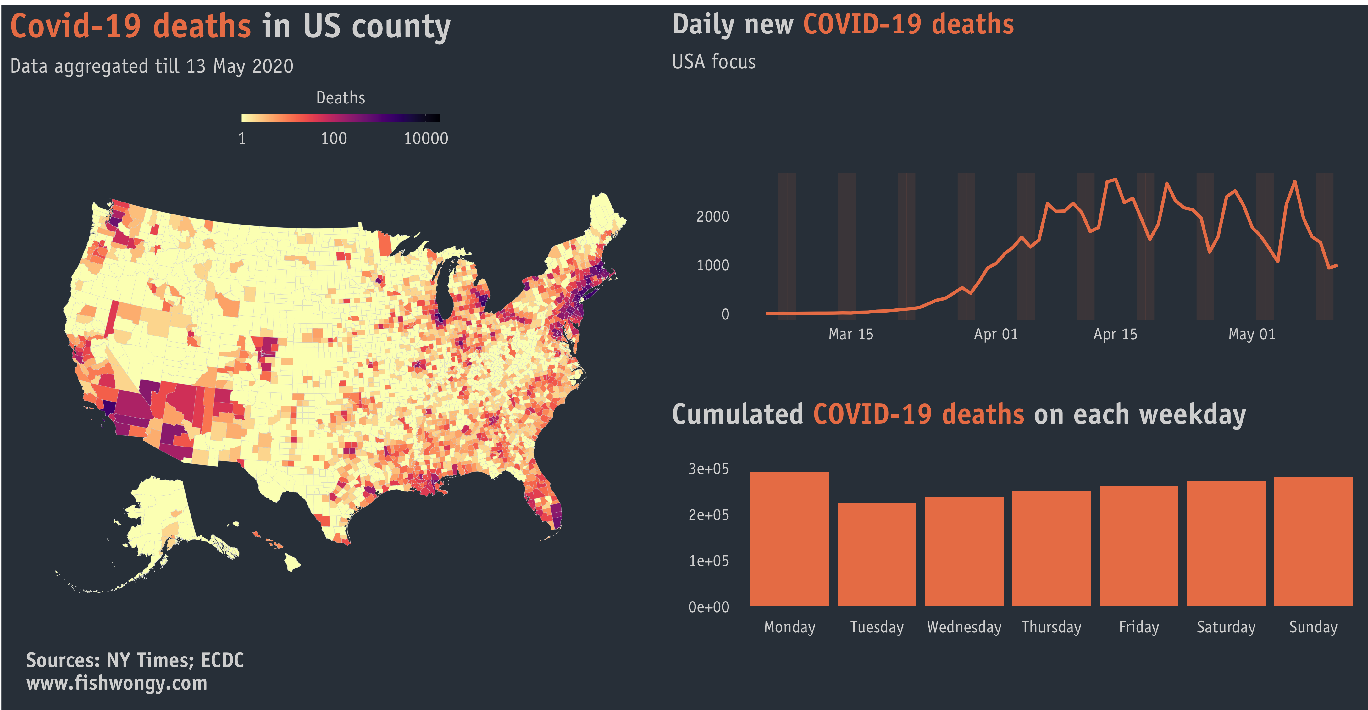
Although it looks like patients lose their lives less during the weekend, it is indeed Monday and Tuesday recorded the least covid-19 cases and deaths.
So which countries have more daily recorded cases and what countries have less?
Does a similar pattern apply to daily deaths as well?
And again, a US version of the graphs above.
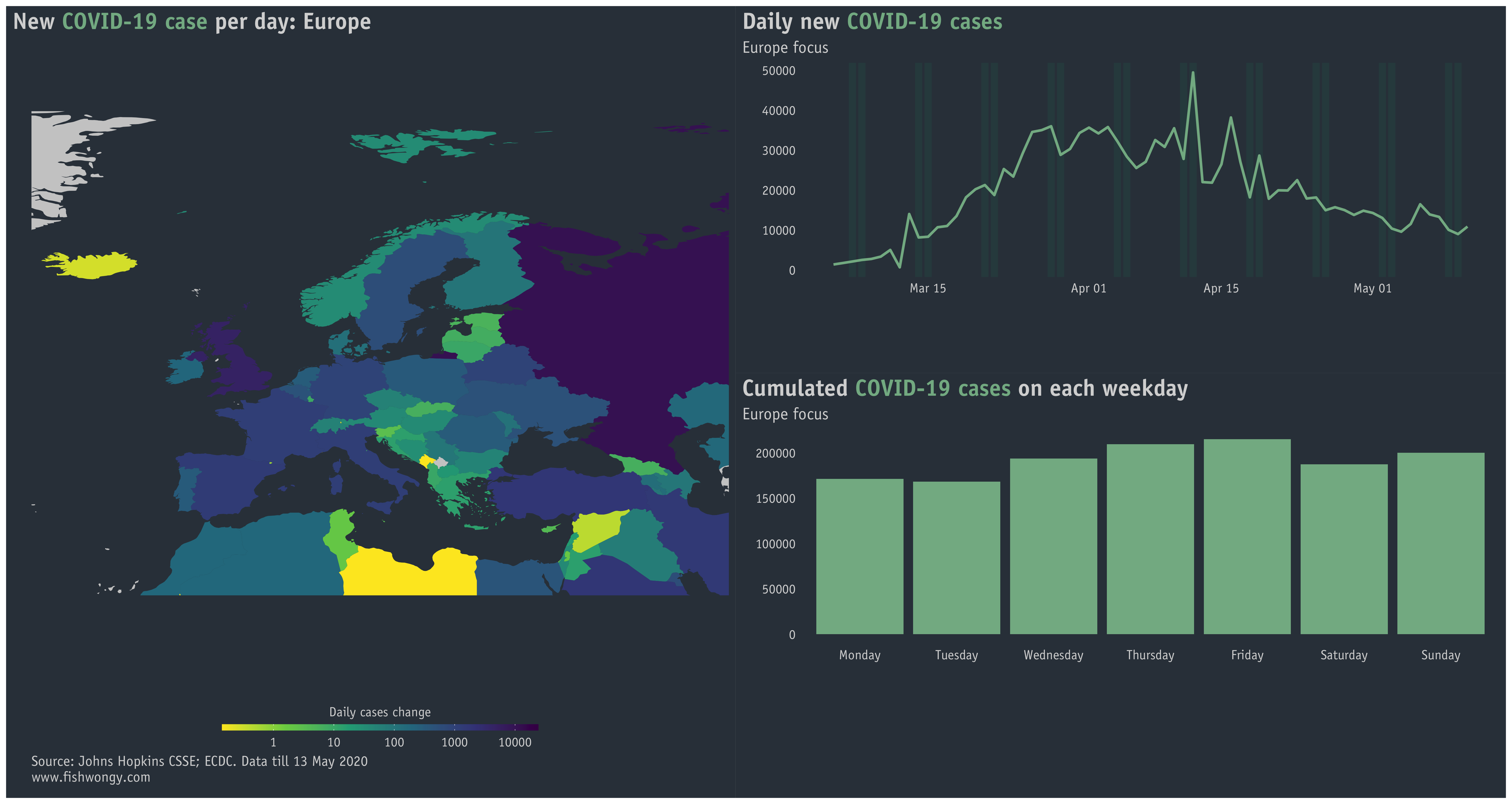
And a Europe version
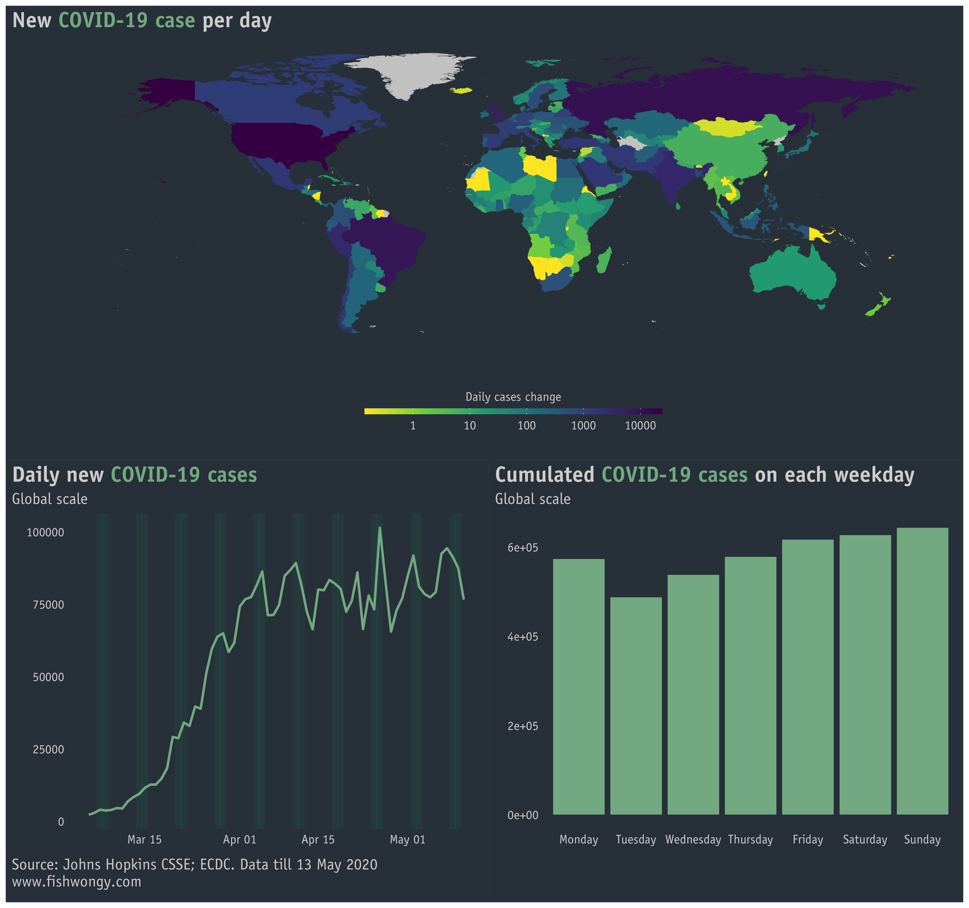
Lastly, a Europe map showing active cases and daily cases increase in different EU countries.
Thanks for reading. Stay safe!