This week’s covid-19 analysis focuses on mobility and the government’s intervention on social policy in fighting covid-19.
Google is now sharing anonymised mobility data based google map’s user.
Using the given data, I produced visualisation on the region’s mobility based in terms of transportation type and destination.
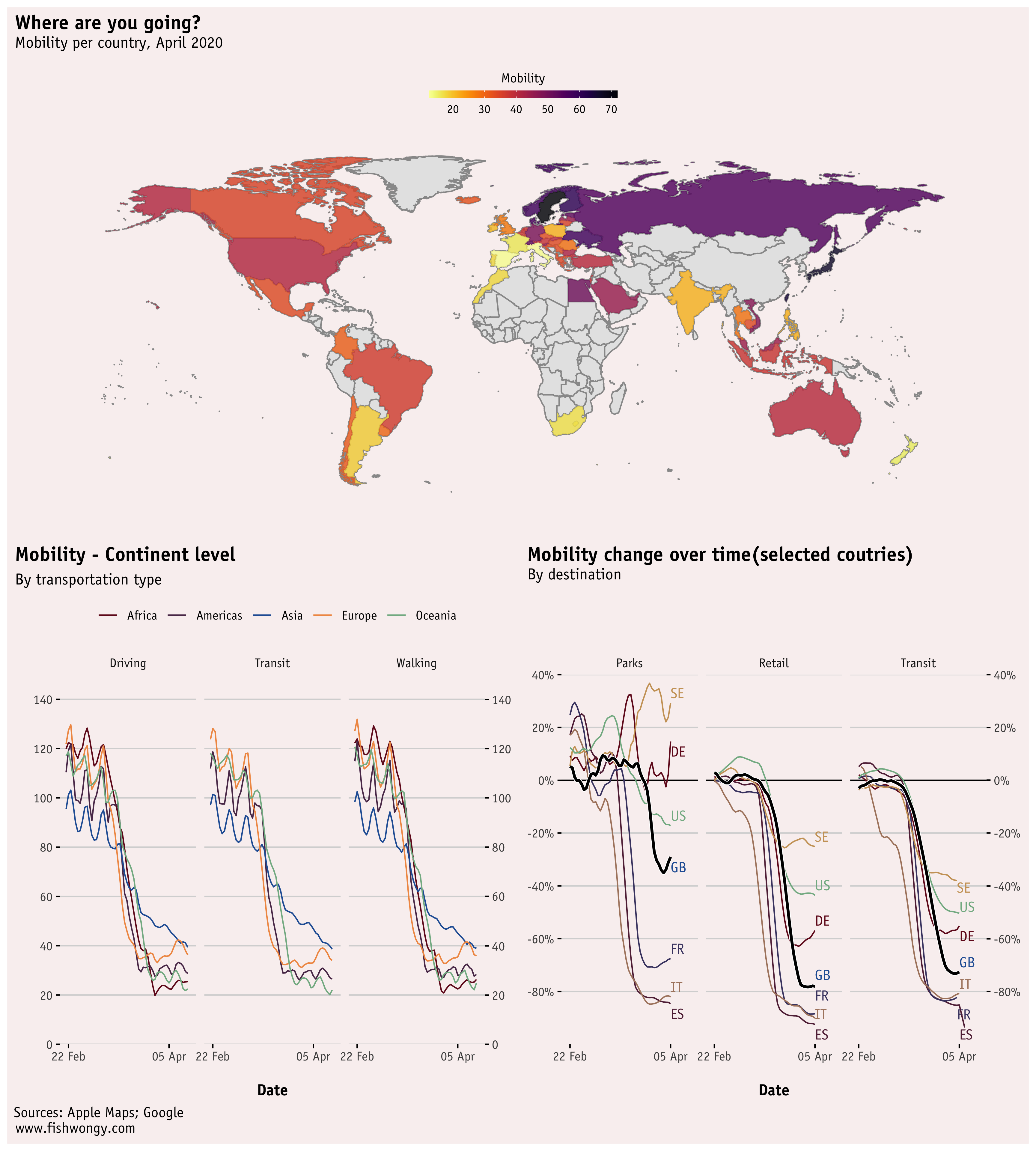
The general mobility trend has largely decreased for all of the selected countries and continents since the beginning of the covid-19 crisis. And the mobility of southern Europe is generally lower than the northern part.
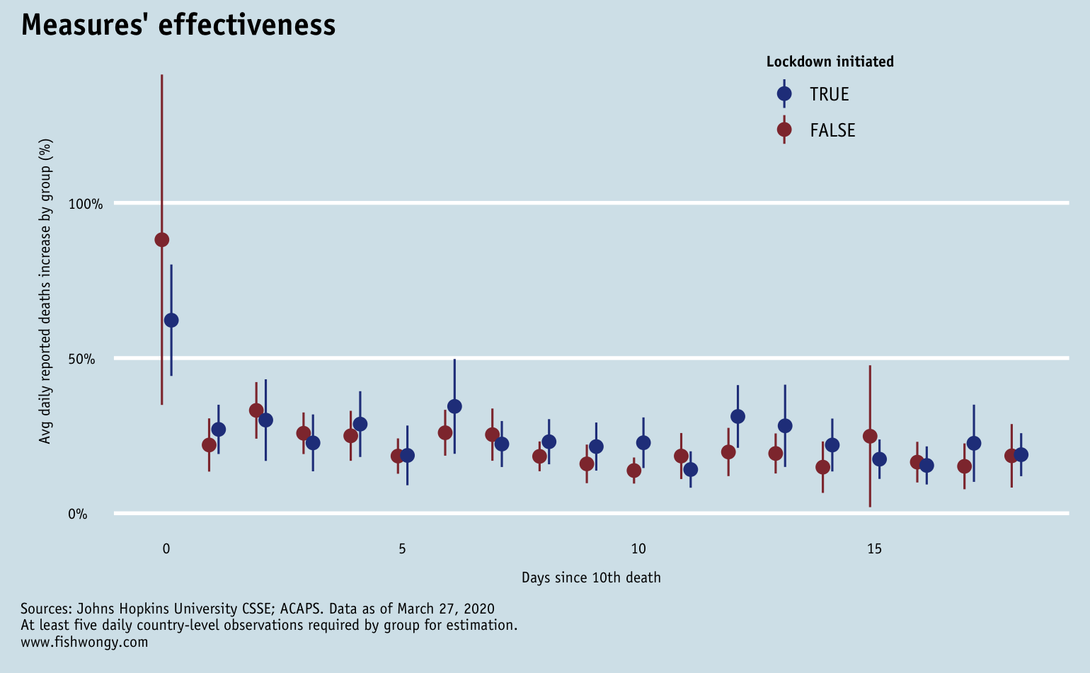
And here is the visualisation related to the government interventions based on ACAPS data. I realised that Oxford has also done research on similar topics and the results might be slightly different compare to ACAP due to different methodology and measurements.
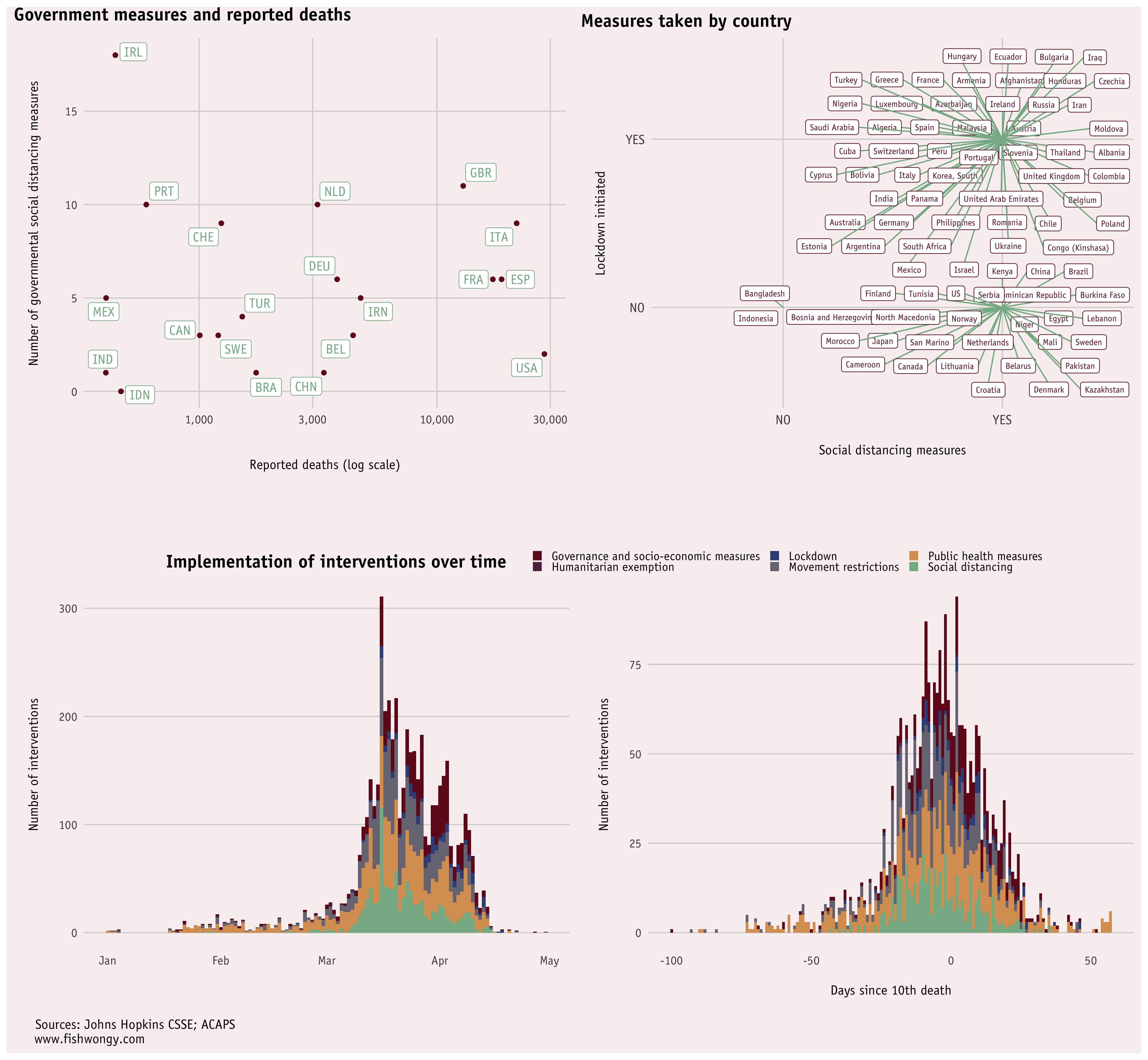
As we can see most countries have their policies implemented before their country’s 10th recorded death.
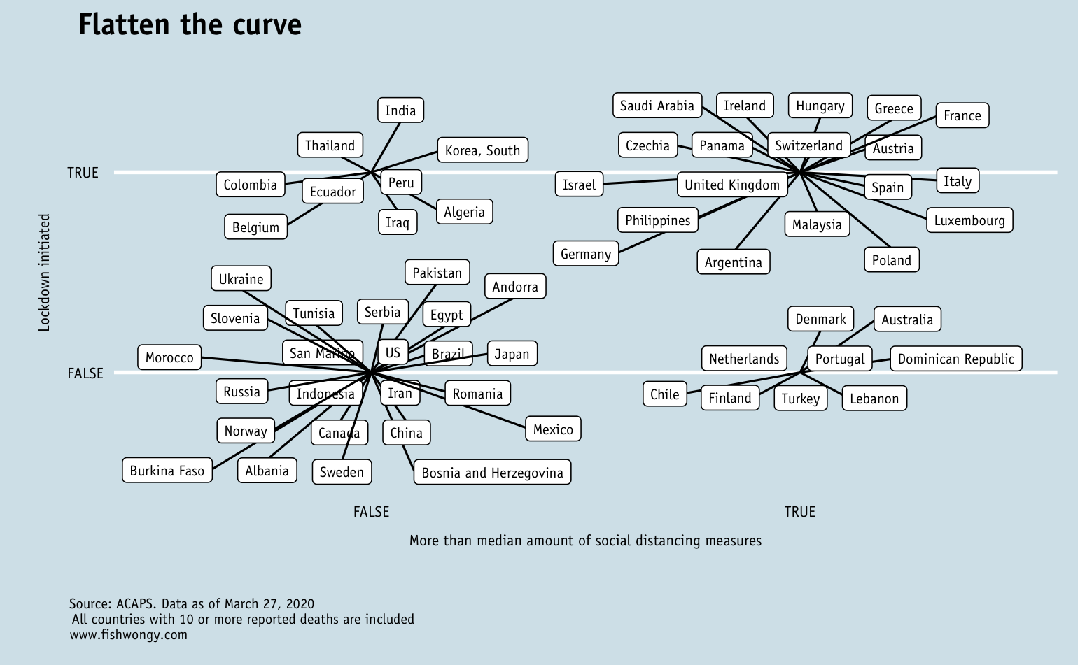
And I have actually produced a similar graph back in March and they might be interesting to look at as well.
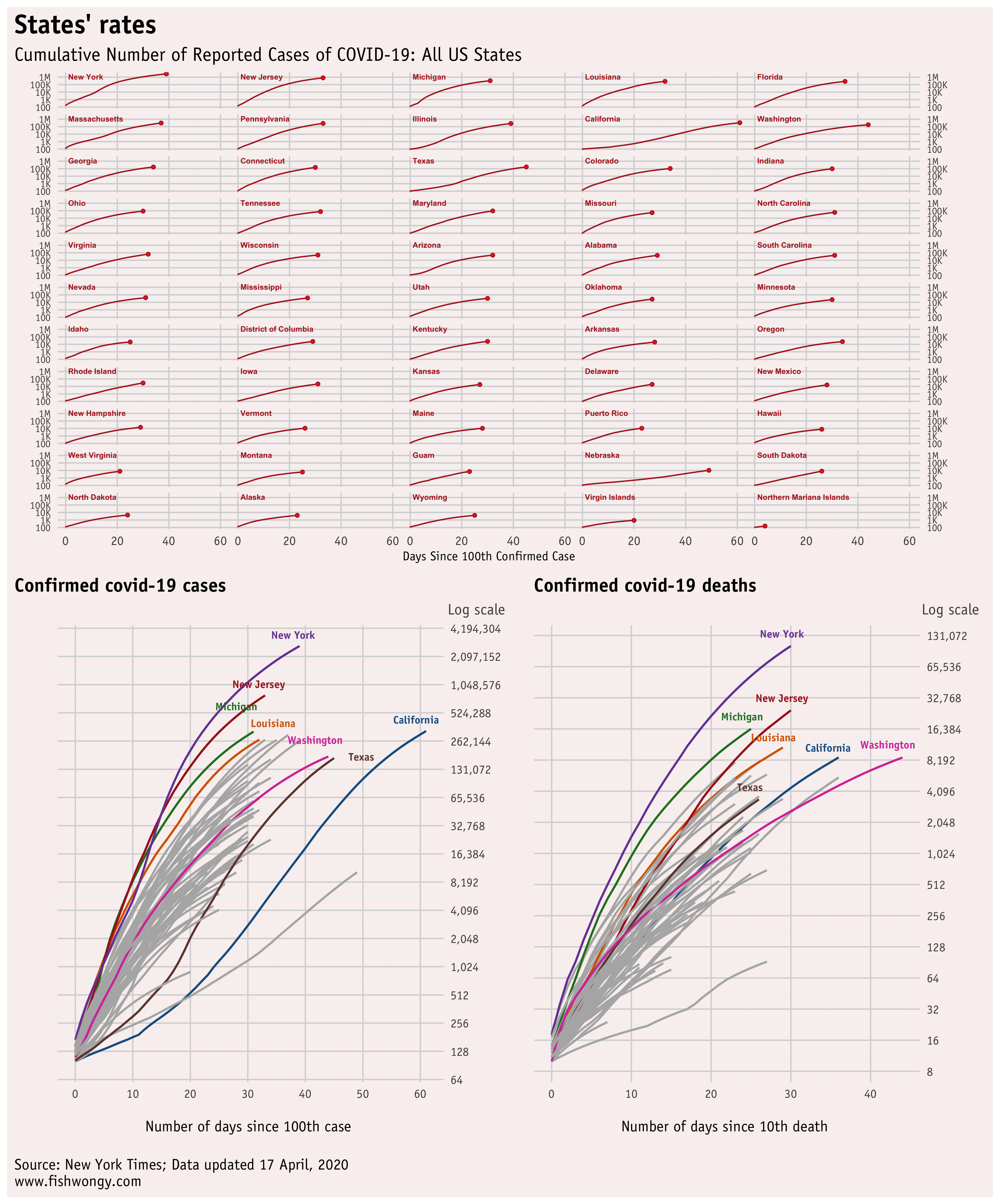
And here are the accumulated charts for different states in the US and the world.
Although New York and New Jersy are still concerning, most of the states are slowing down for both confirmed cases and deaths.
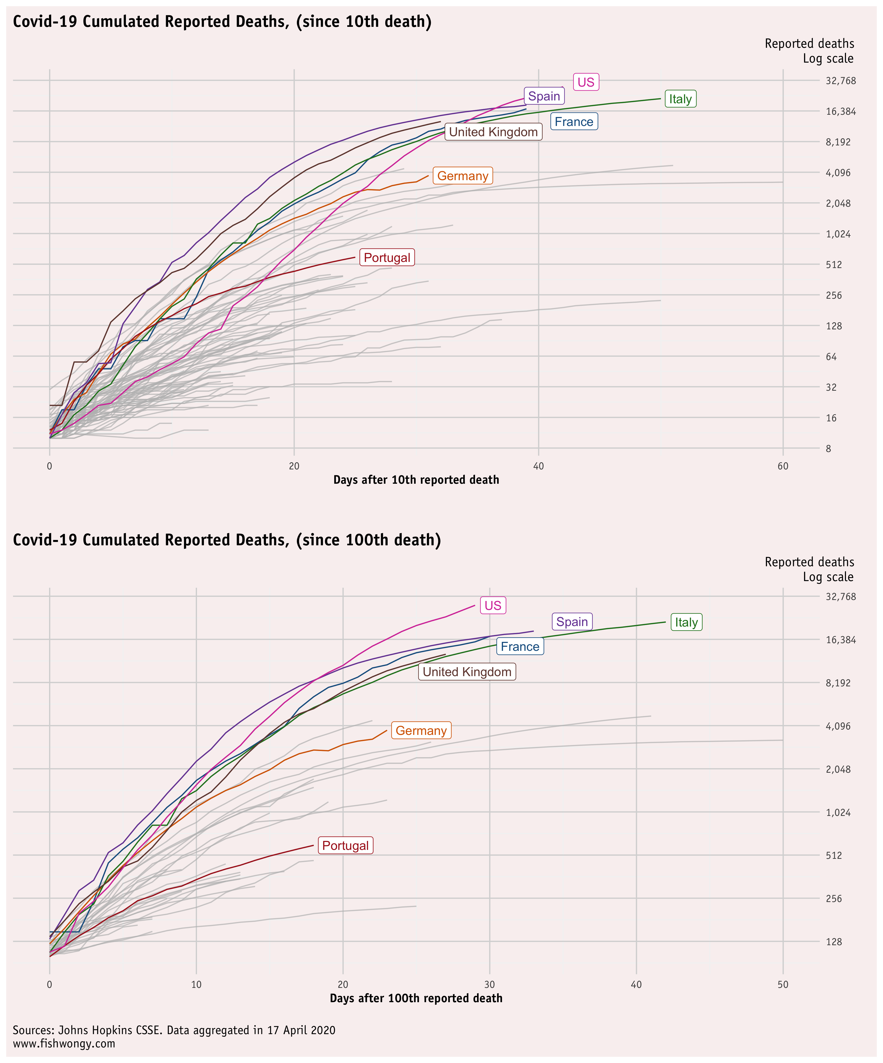
Here are the graphs for world-wide data
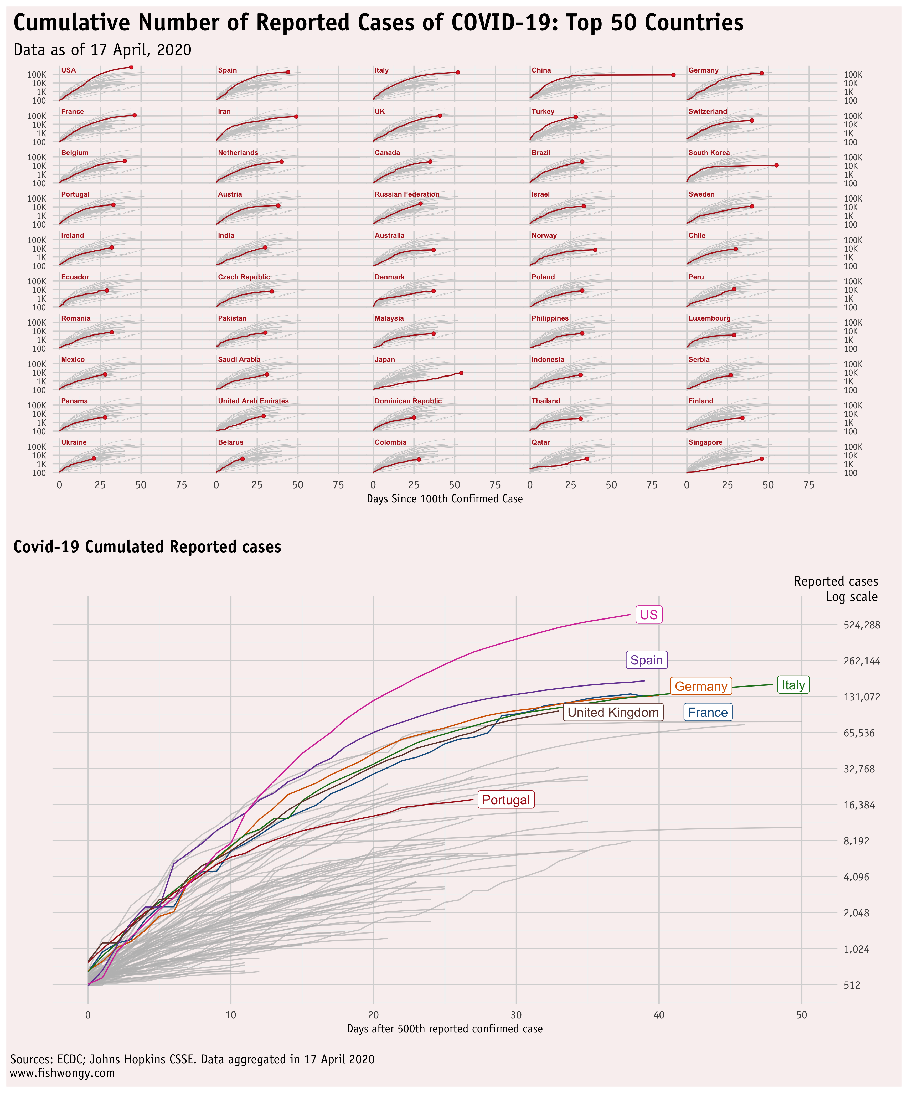
By adjusting the graphs from 10th reported death to 100th reported death, we can compare the severe situation of the US and Spain from a different level.
And here is the graph for daily cases and deaths increase
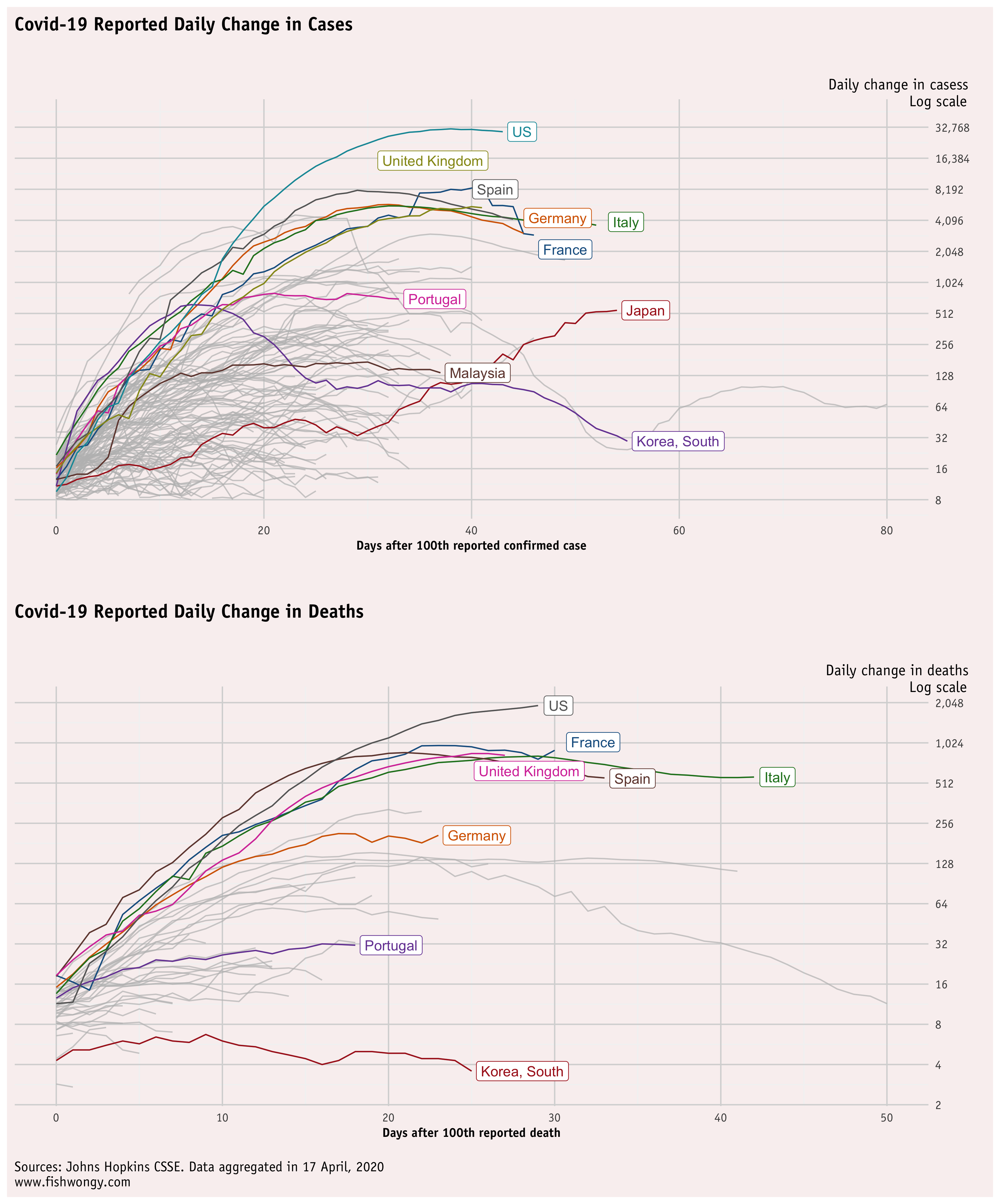
As we can see, most of the countries are now starting to have fewer cases compared to the day before, but the number of death for the US, France and Germany are still showing increases compared to the previous days.
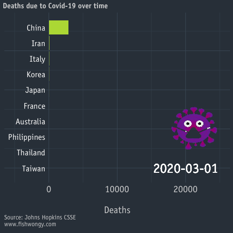
Lastly, here is a racing chart for covid-19 deaths that I produced earlier this month.
Thank you for reading, stay safe!