
This week I try to look at the unemployment rate in the US and its relationship with covid-19.
As the corona situation goes on and government officials from different countries began to take active measure, not only an increasing amount of people are now working from home, some even got laid off due to the depressing economy. Many experts have already pointed out that it is expected to take time for economic recovery after the epidemic ends.
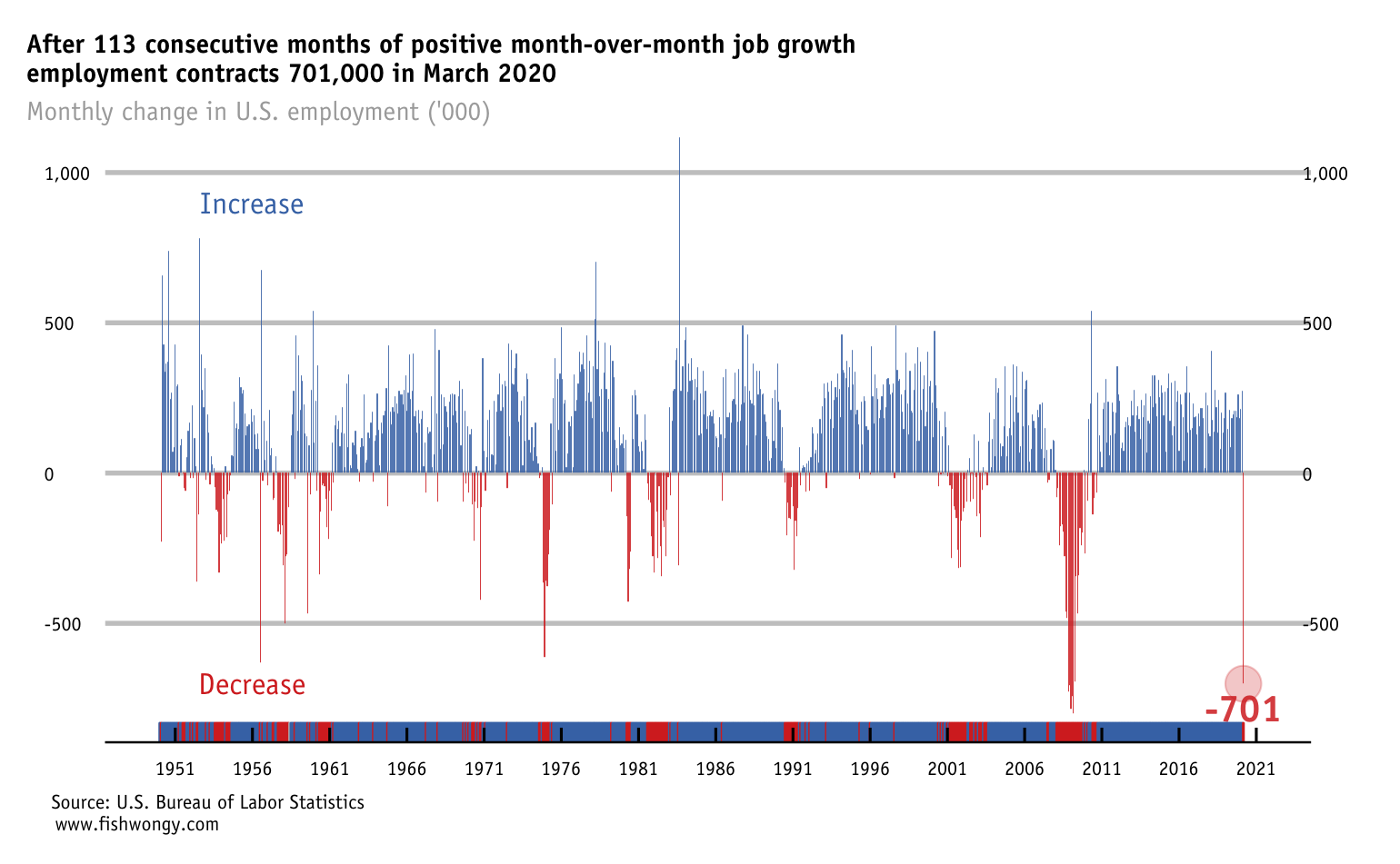
Earlier this month, the U.S. Bureau of Labor Statistics released its monthly employment situation summary for March 2020. While it is already expected that the US labour market to show some weakness as the economy is shut down, the magnitude of the contraction is still surprising.
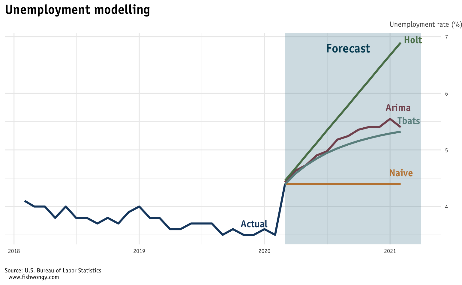
Then I tried to use a few time-series forecasting model to predict the unemployment rate for the next 12 months.
Naive model is known as the least-predictive model and most of the time use as a tool to evaluate the performance of other models. As such, if we consider the rest of the models, it is expected the unemploy rate in the US continues to rise in the next 12 months.
DISCLAIMER
The simulation results in this blog post should not be used as actual estimates of unemployment or any other aspect of the COVID-19 pandemic. The simulation is intended to permit further exploration of the potential effects of covid-19 to society.
FT-like charts
Cumulated cases since 100th case (US)
While California has more cases (nearly double) than Washington and Texas, their curves are in actuality steeper than California. Reasons here could be multiple, for instance, covid-19 is more contagious in those areas or those states test more people etc.
.png)
Cumulated deaths since 10th death (US)
While New Jersey has the second most steep curve for confirmed cases, Michigan actually overtook its place in the confirmed death graph. That said, the death rate in MI is expected to be higher than NJ.
.png)
And lastly, here are the small graphs for all of the States.
.png)
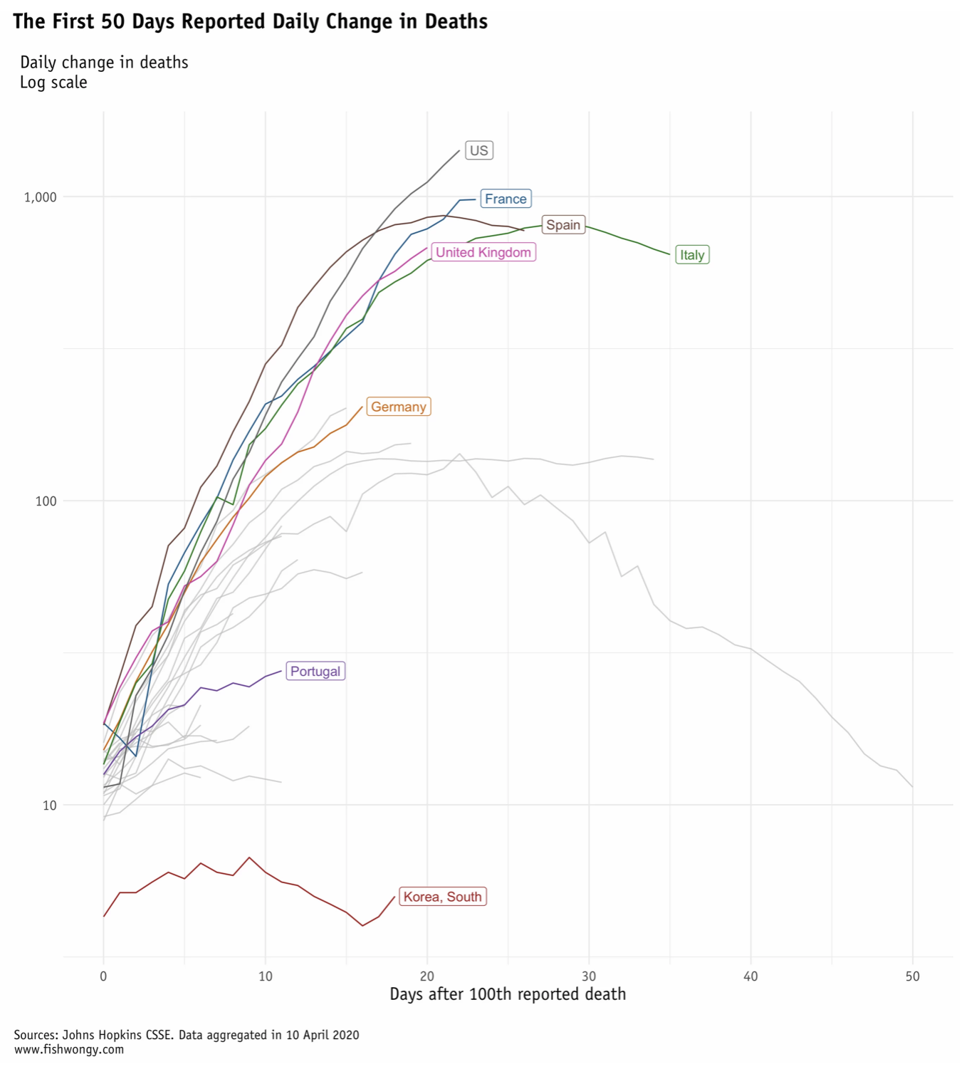
Spreading curves
Now let’s look at the well-know spreading curve.
Recently, the Financial Times began to trace covid-19 with the daily confirmed case/ death numbers to see are countries really flattening the curve, and I tried to replicate the graph as well.
Here is the graph for daily cases
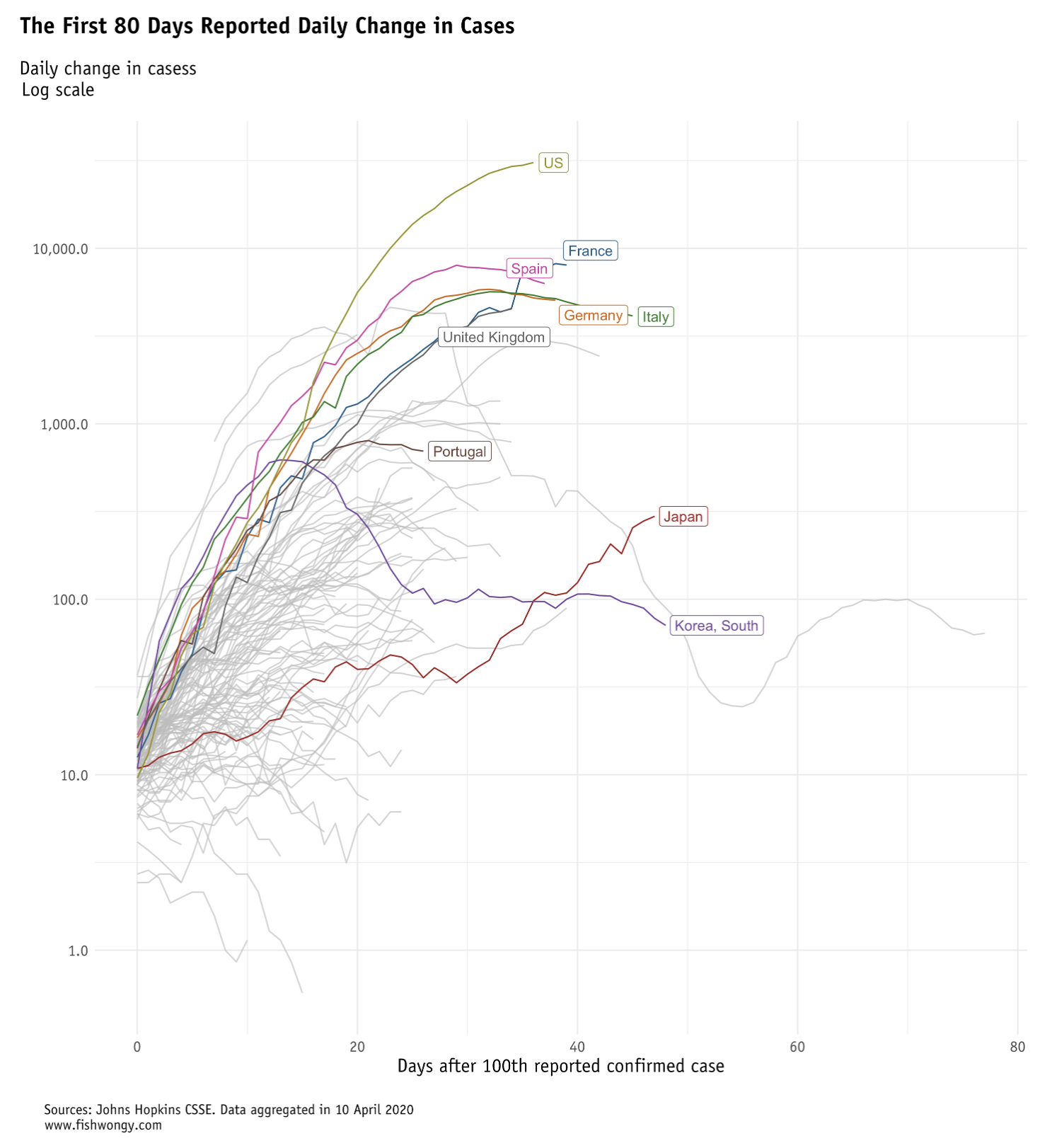
As already pointed out by many, while the US and the UK show a bit of slowing down in their confirmed cases, the number of deaths for both countries are still increasing on a daily basis.
And here is the small graphs for the most affected 50 countries around the world
.png)
Thank you for reading and I wish you a happy easter!